US stocks are hovering near all-time highs, buoyed by the prospect of cooling trade tensions between the US and China as corporate America largely brushes off tariff pressures. But that doesn’t mean that Wall Street professionals will be sleeping easy this Halloween.
Towering valuations, an ever-widening wealth gap and growing US debt imbalances are just some of the key risks haunting market watchers.
Bloomberg News asked seven finance professionals what charts spook them right now. Here’s what they shared:
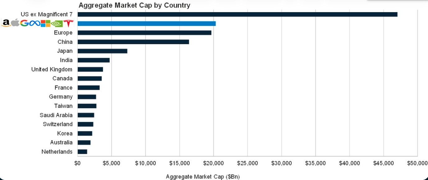
Rob Arnott, founder of Research Affiliates:
The so-called `Magnificent Seven’ are wonderful companies with wonderful products; most have soaring revenues and profits. But, they are priced for perfection. Market value is supposed to be the market’s best guess as to the net present value of all future profits that will flow to the shareholders.
At end-September, these seven stocks were worth $20 trillion, which is more than the entire Chinese stock market, more than all European stock markets combined, and 150% more than Japan. Are these seven companies really going to provide profits to their shareholders larger than the entirety of Europe, than the entire Chinese economy? That’s a tall order.
Phillip Colmar, founding partner and global strategist at MRB Partners Inc:
The US government is providing unusually aggressive fiscal stimulus amidst an economic expansion. This is positive for economic growth but increases the risk that the bond market will become unnerved. Increased debt issuance will need to compete for existing savings and at some point could drive yields much higher.
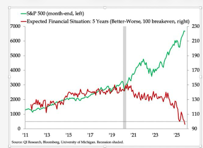
Danielle DiMartino Booth, chief executive officer and chief strategist at QI Research:
We’re almost numb to hearing that the top 10% of earners account for half of US consumption. Seeing the historic breakdown in US households’ expectations for their financial security pitted against the stock market that’s driven the spending of the top 10% most starkly depicts the inequality divide that defines the United States as a nation today.
If Federal Reserve officials ever doubt that monetary policy has played a role in widening the gap between the haves and have nots, this graph should quash any lingering doubts.
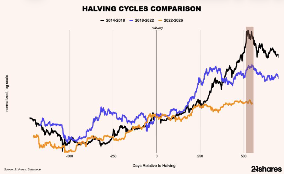
Adrian Fritz, chief investment strategist, 21shares:
Is the Bitcoin rally over, or is the four-year cycle broken? That’s the debate haunting crypto investors this Halloween. Many believe this time is different: institutional adoption, spot-ETF approvals and inflows, corporate treasury buying, regulatory tailwinds and supportive macro factors, from expected rate cuts to a lagging business cycle, could extend the bull run beyond historical patterns.
However, Bitcoin’s two prior cycles both peaked roughly 530 days after each halving, like clockwork. With the latest halving in April 2024, the same rhythm appears to be repeating, raising the question of whether this rally still has legs, or if the simulation is repeating itself.
Isabelle Williams, deputy head of investment solutions at Dimensional Fund Advisors:
Mutual fund and ETF costs for investors extend beyond the expense ratio. Lurking in the shadows are other costs that can detract from returns. The tax-cost ratio measures how much a fund’s annualized return is reduced by the taxes investors pay on distributions. With recent positive performance among many asset classes, tax-cost ratios across Morningstar categories show that many were higher than average expense ratios as of one year, ending September 30, 2025.
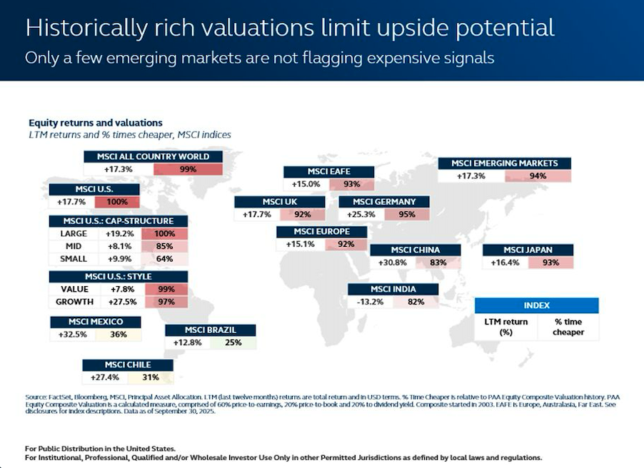
Todd Jablonski, chief investment officer at Principal Asset Management:
Valuations across developed markets remain at historically elevated levels, particularly in the US, suggesting that future return potential is increasingly constrained. With nearly all major markets screening as expensive versus history, there’s little margin for error if growth momentum softens or policy support fades.
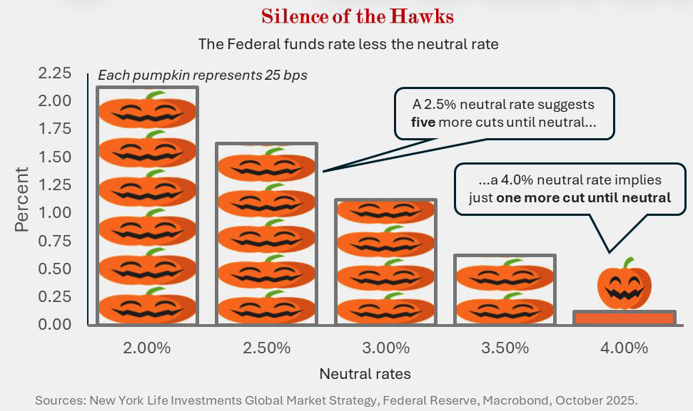
Lauren Goodwin, economist and chief market strategist at New York Life Investments:
The neutral rate (r* or `r-star’), the rate at which the fed funds rate is neither stimulating nor restraining economic growth, is as hard to spot as a specter on a ghost-hunting tour.
The neutral rate is more than just a theme haunting academics and macro nerds: It shapes the cadence and number of further policy rate cuts, as well as the narrative around how `restrictive’ monetary policy is. For example, if the neutral rate is as high as 3.50%, then a Fed moving to neutral would, in theory, only cut a couple more times from the current policy rate’s 4.25% upper range. If the neutral rate is lower, the Fed has room for more cuts.
One way the Trump administration has sought to lower policy rates is to argue for a lower neutral rate. But the neutral rate isn’t observable in real time; we only know where it is based on how the economy is performing. And though some sectors – such as housing and other rates-sensitive sectors – are struggling under the weight of higher market rates, overall economic activity and market liquidity are healthy. Stickier inflation, AI capex spending, and geopolitical changes may also have nudged the neutral rate higher than in past cycles.
A message from Advisor Perspectives and VettaFi: Discover something new! Click here to register for our upcoming webcasts.
Bloomberg News provided this article. For more articles like this please visit
bloomberg.com.