The defining statistic of the so-called K-shaped economy is a little hard to define.
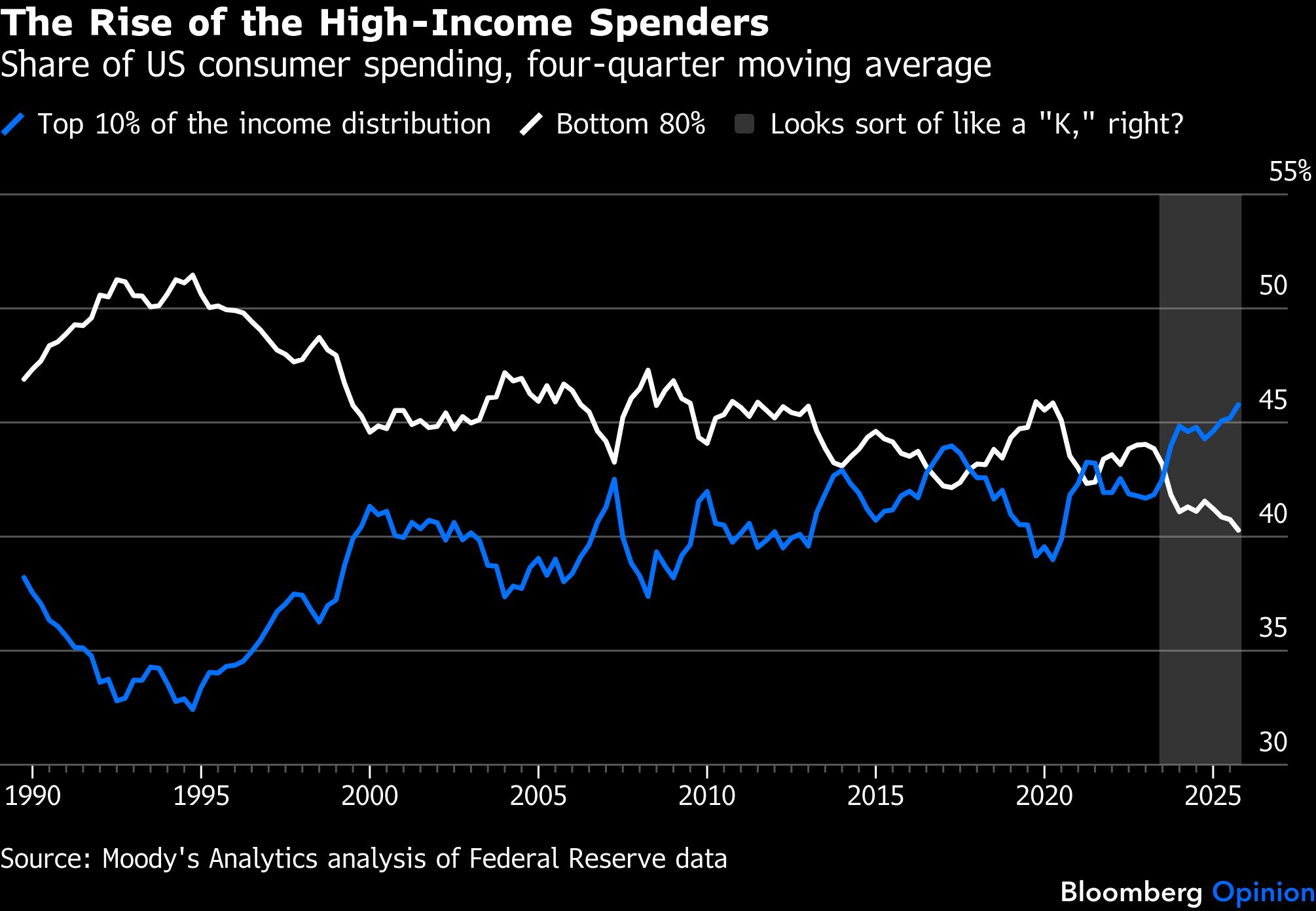
According to Moody’s Analytics, the top 10% of Americans by income were responsible for 45.8% of consumer spending last year. Before a change in methodology to reflect the impact of taxes, this figure was estimated at 49.2% as of mid-2025, leading to the oft-repeated claim that nearly half of consumer spending was being driven by the top 10%. Put their revised spending and that of the bottom 80% in a chart together, and you can still see something like a “K” emerging over the past couple of years.
These statistics seem to offer striking evidence of rising economic inequality — and also of the potential fragility of the current expansion, given that they show the top 10%’s spending share rising and falling with asset prices. These statistics are also implausible, as skeptics will point out on social media every time the “nearly 50%” claim is shared. They often cite an X.com thread by economist Antoine Levy of the University of California at Berkeley’s Haas School of Business, in which he explained that while those in the top 10% of the US income distribution probably account for about 50% of pre-tax income:
They face higher income-tax rates than those with lower incomes, with most estimates putting their share of disposable income after taxes and transfer payments in the range of 30% to 37%.
Their share of spending must be lower than that because people with higher incomes tend to have higher saving rates.
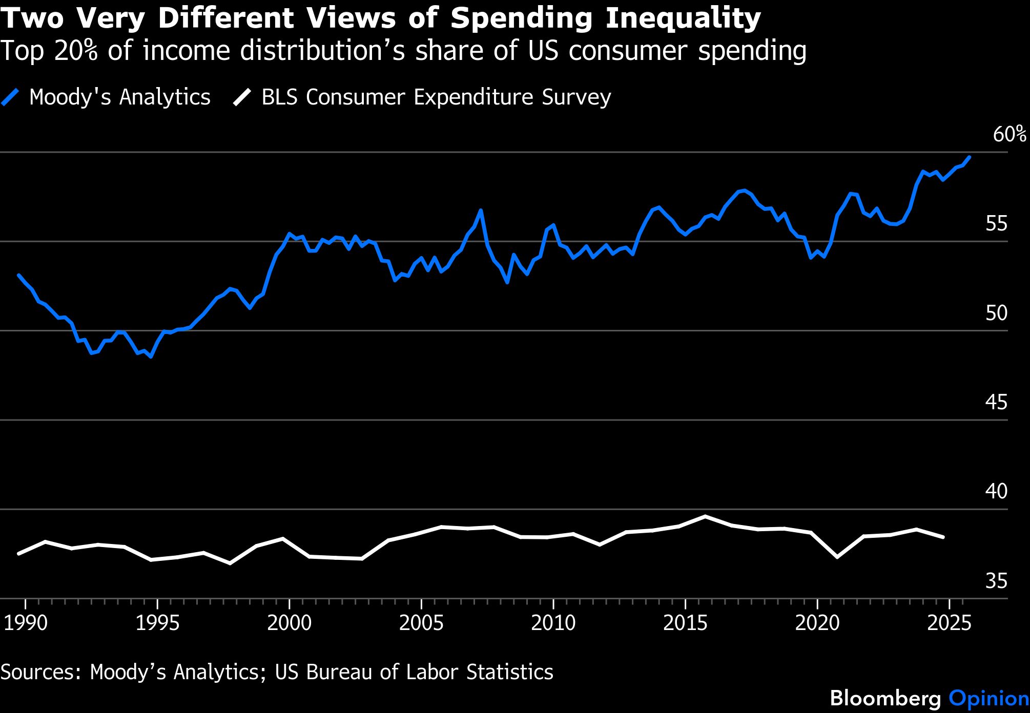
The main official source of data on the distribution of consumer spending, the Bureau of Labor Statistics’ annual Consumer Expenditure Survey, reports that consumer units (like households, but not exactly) in the top 10% of the pre-tax income distribution accounted for 22.9% of spending in 2024, down from 23.5% in 2014. That’s as far back as the BLS breaks out numbers for the top 10%, but for the top 20% one can compare the two series back to 1989. They tell very different stories.
Does this mean the Moody’s Analytics consumer spending numbers are wrong? Well, they almost certainly aren’t right — but the same goes for the BLS numbers. Especially suspect is the nearly unchanging share of consumer spending that the BLS attributes to the top 20% over the past 35 years.
“I feel more confident in the historical trajectory than I do in the actual levels,” said Mark Zandi, chief economist at Moody’s Analytics and keeper of the spreadsheet that churns out its quarterly consumer spending estimates. “I wouldn’t die on the hill of the top 10% accounting for 45% of the spending, but I would fight hard that the share that’s going to folks in the top 10%, top 20% has risen significantly and consistently over the past 30, 35 years.”
The method Zandi uses to estimate consumer spending combines data on asset holdings by income from the Federal Reserve’s triennial Survey of Consumer Finances with data on asset flows from its quarterly Financial Accounts of the US. The idea to merge the two originally came from then Fed Chairman Alan Greenspan in the late 1990s.
“My understanding is he actually sketched it out on a napkin on an airplane flight,” said economist Dean Maki, who along with his Fed colleague Michael Palumbo was charged with making Greenspan’s idea operational and using it, in 2001, to estimate the “wealth effect” on consumer spending during the 1990s stock market boom. “One thing I learned from doing that research back when I was at the Fed was that wealth effects are important,” said Maki, now chief economist at asset manager Point72. “They were an important driver of consumer spending then and they still are today.”
Since 2019, the Fed has published Distributional Financial Accounts that use this approach to estimate quarterly changes in wealth by income group and other demographic characteristics. Zandi has made his own tweaks to calculate spending estimates, and Maki said he didn’t know enough about them to comment. But Benjamin Hoham and Fang Yang of the Federal Reserve Bank of Dallas recently used Zandi’s methodology, with adjustments for taxes that Moody’s Analytics subsequently adopted, to estimate that Americans in the top 20% of the income distribution had accounted for 56.5% of consumer spending so far in the 2020s — close to the 57.2% average in Zandi’s data and far above the 38.3% reported by the BLS.
It is telling that Hoham and Yang chose to report averages over several years and not quarterly statistics. The Fed’s quarterly numbers are volatile and subject to revision, and while Moody’s Analytics smooths them out a bit by using moving four-quarter averages, these may still represent more noise than signal over the short-term. You probably shouldn’t be using them to track consumer spending.
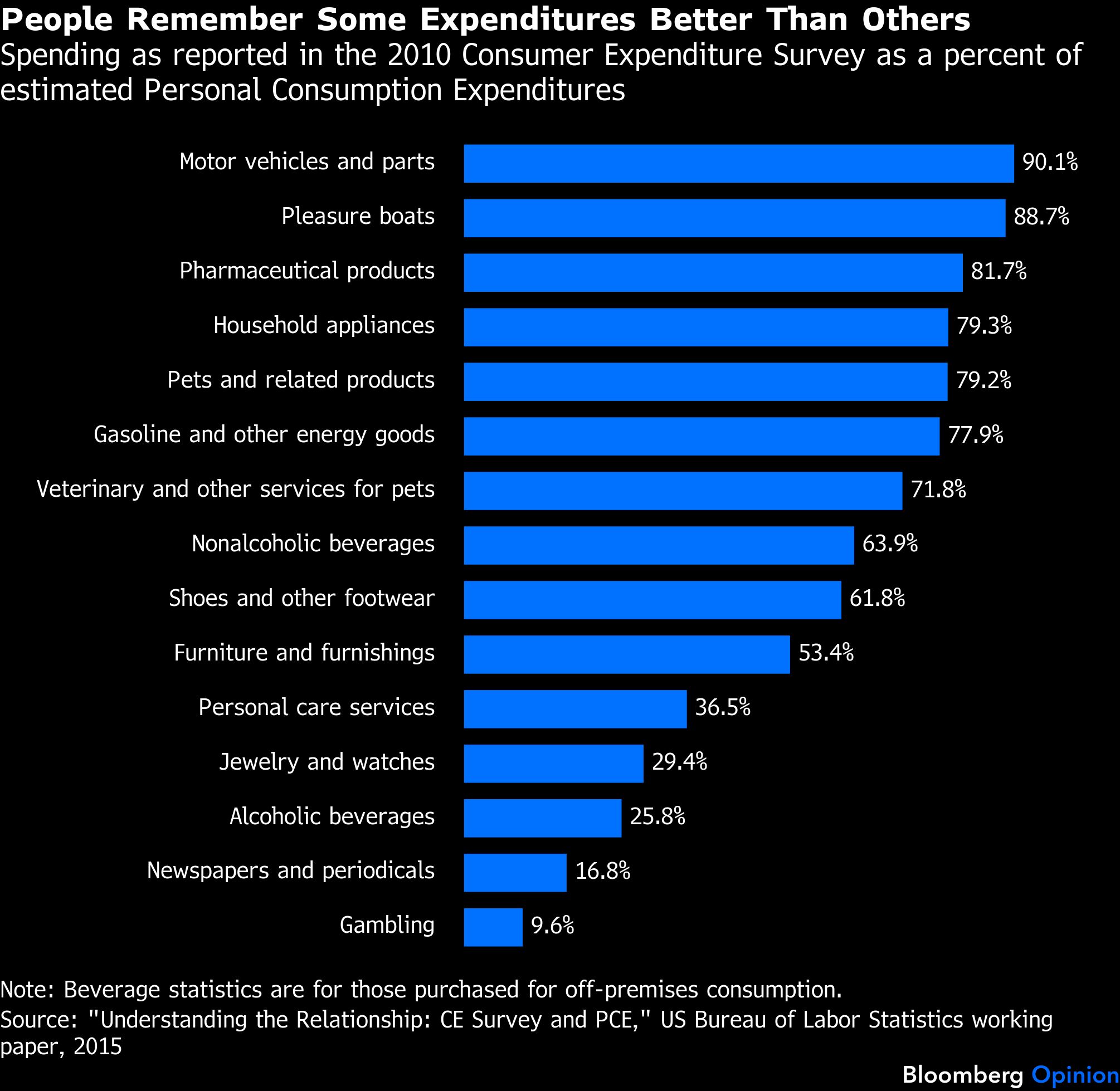
The statistics from the BLS showing almost no change through the decades in high-income households’ share of spending also have their problems, though. One is that the Consumer Expenditure Survey misses out on a lot of actual consumer expenditures, with respondents apparently having an especially hard time remembering gambling losses and spending on media subscriptions and alcoholic beverages.
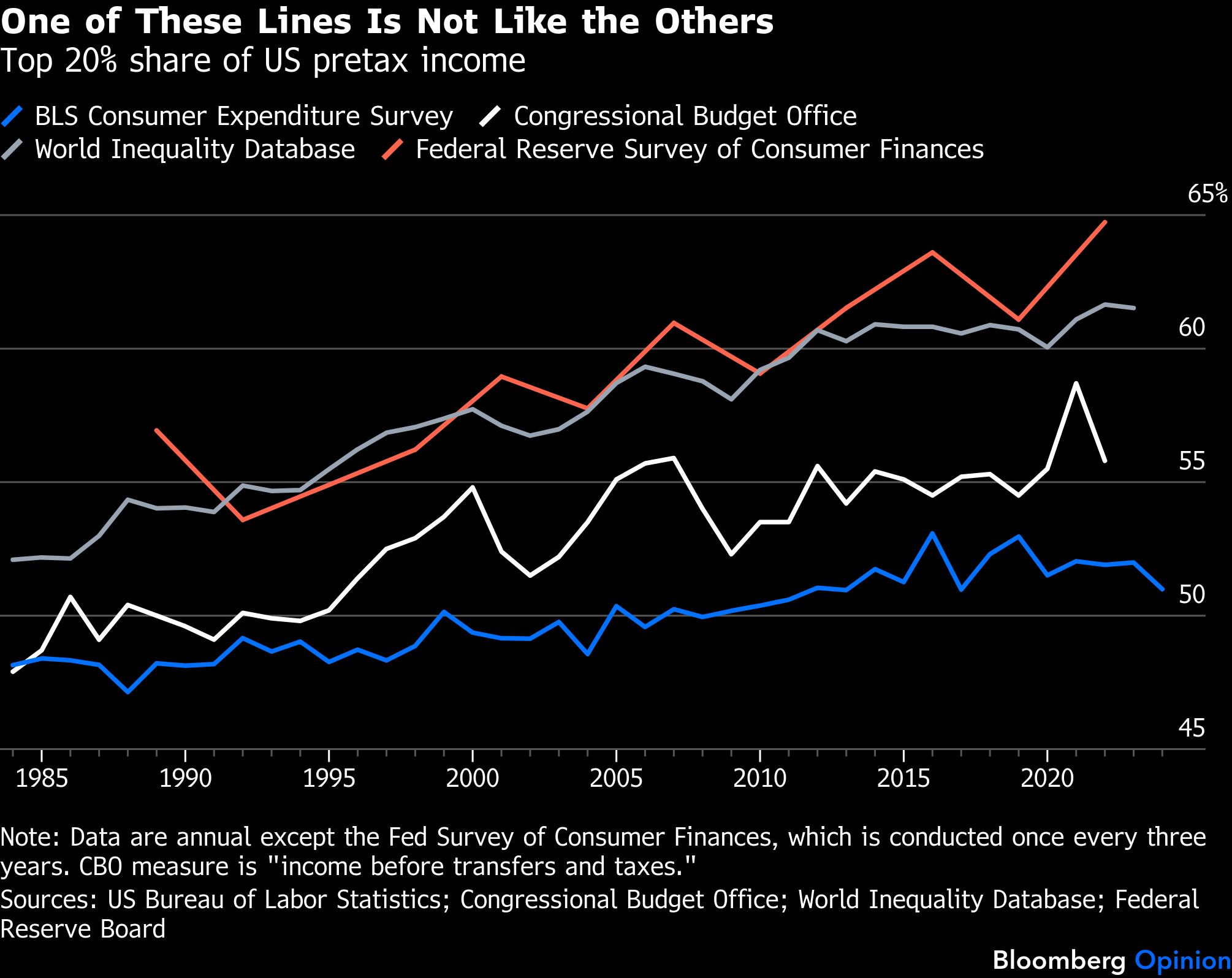
Another problem is that those with the highest incomes are the most reluctant to talk about their incomes and spending. As an illustration, here’s how Consumer Expenditure Survey estimates of the share of pre-tax income earned by the top 20% compare with those of the World Inequality Database and Congressional Budget Office, which are derived chiefly from income tax data, and with the Fed’s Survey of Consumer Finances, which oversamples high-income households in an attempt to get a clearer picture of how wealth is distributed.
So what is the top 10%’s share of consumer spending? The simple answer is that we don’t exactly know, which is true of many aspects of economic inequality in the US — witness the ongoing debate over how much the income share of the top 1% has actually risen. There are good reasons to think the Moody’s Analytics top-10% spending estimate is too high and the BLS estimate too low, but not much basis for drawing strong conclusions beyond that.
Recent spending numbers from other sources offer a mixed picture. The Bank of America Institute reports that higher-income BofA customers have seen stronger spending growth over the past 12 months than other income groups, but the gap narrowed somewhat this February. An analysis of internal data from payment processor Stripe by the company’s chief economist Ernie Tedeschi (a former Bloomberg Opinion contributor) found that the share of payments coming from high-income zip codes rose in 2025 but retraced all those gains this January and February. Regardless of where between 45.8% and 22.9% the top 10%’s true share of consumer spending lies, it’s a major driver of economic activity. If high-income households pull back, we’ll all feel it.
A message from Advisor Perspectives and VettaFi: Discover something new! Click here to register for our upcoming webcasts.
Bloomberg News provided this article. For more articles like this please visit
bloomberg.com.