The Bubble – Contains the Collapse – Contains the Resurgence
Membership required
Membership is now required to use this feature. To learn more:
View Membership Benefits6/12/2025

When investors approach the financial markets, there’s a tendency to imagine that conditions can be judged as favorable or unfavorable based on one single measure or another. The fact is that market conditions at any moment in time are a composite of interdependent forces. For example, if the market is declining steeply, trend-following measures will be dismal and unfavorable, but at the same time, valuations will be improving, sentiment might be bearish enough to serve as a positive contrary indication, and various technical measures might be so overextended that they suggest a strong – if ultimately fragile – advance to clear the compression.
Market conditions can’t be separated that cleanly. This is, because that is. This is not, because that is not. If you look deeply into a speculative bubble, you can see the market collapse in it. If you look deeply into a market collapse, you can see the bull market in it. Each is a continuation of the other.

The opening quote by William James walks peacefully with the teaching that everything is a formation – a composite of countless other things. It’s also instructive for investors, because it discourages the kind of thinking that relies on forecasts and predictions. It also discourages the kind of thinking that assumes that present conditions will be permanent. Instead, it encourages the kind of flexibility that’s content to respond and align with conditions in the present moment, aware they may change tomorrow.
In our own work, we certainly attend to risks like extreme valuations, and various syndromes that have historically been associated with strong outcomes one way or another. Yet as I emphasize in every market comment, nothing in our discipline relies on these potential risks or outcomes being realized.
If someone reads my stuff and says “Hussman is predicting X,” particularly as if we rely on X to happen, they didn’t read my stuff. Investors who rely on specific forecasts and scenarios suffer needlessly, because every market movement is seen through the lens of “correct” or “incorrect”, rather than a potential opportunity to realign the sails.
Despite the glorious experience we enjoyed over decades of market cycles before quantitative easing, the most difficult aspect of the zero-interest rate experiment was the sheer persistence of speculation. As investors became convinced that There Is No Alternative™ but to speculate (TINA), no overvalued, overbought, overbullish condition was too extreme, and we lost the flexibility we had always enjoyed.
All the adaptations we’ve made in this bubble have served one objective: to restore our strategic flexibility even amid market conditions that rivaled the most extreme instances in history. The reason for my irrepressible enthusiasm about the hedging implementation we introduced last September was that it cleanly added a fresh degree of freedom – allowing us to systematically vary the intensity of our hedge positions even in the most extreme market conditions. That enthusiasm has continued to be well-placed (for more, see Asking a Better Question, Subsets and Sensibility, and the section titled “The Martian” in The Turtle and the Pendulum).
The core of our discipline is to align our investment stance with prevailing, measurable, observable market conditions, and to change our investment stance as those conditions change. No forecasts are required.
As I noted in April, we can accept the prospect of a collapse to run-of-the-mill valuations just as easily as the prospect of record valuations and endless monetary interventions. History has a great deal to say about the likelihood of one versus the other, and arithmetic has a great deal to say about the very different long-term returns that investors could expect in those different situations. Still, we’ll take good care of the future by taking good care of the present moment, again, and again. That’s where we focus our attention.
Valuations
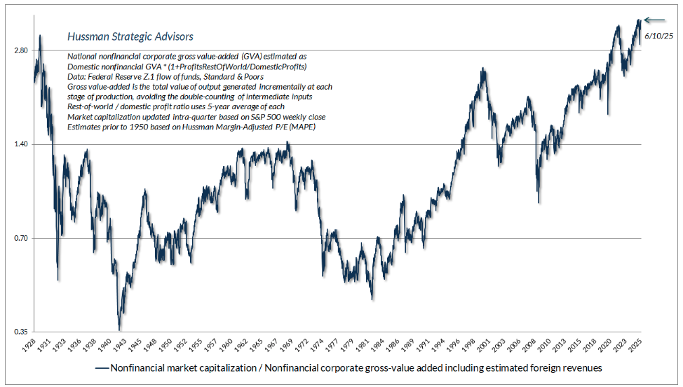
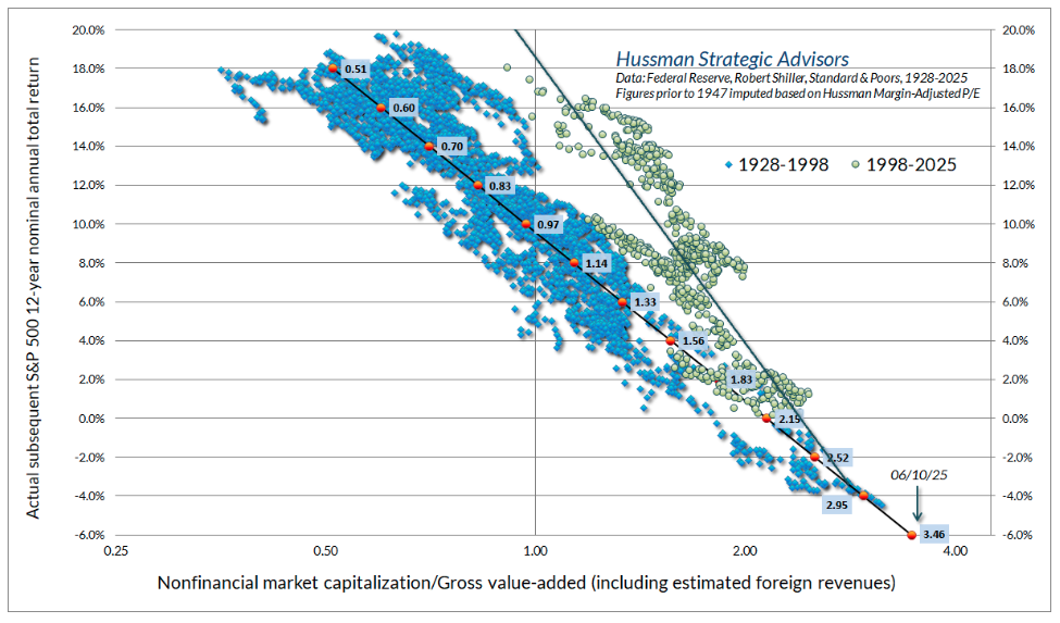
The chart below shows our most reliable valuation measure, based on correlation with actual subsequent S&P 500 10-12 year total returns in historical data spanning a century of market cycles. The blue line shows the market capitalization of U.S. nonfinancial equities as a ratio to their gross value-added, including our estimate of foreign revenues. MarketCap/GVA presently remains beyond the 1929, 2000, and even 2022 extremes. Indeed, the current level is less than 1% from the most extreme level in U.S. history, which was set in February of this year.
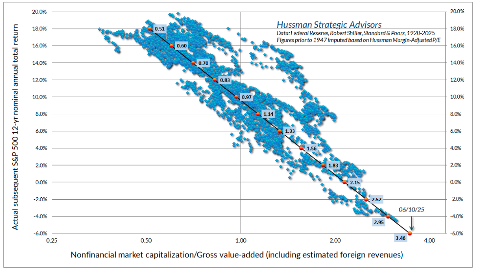
The scatterplot below shows MarketCap/GVA versus actual subsequent 12-year S&P 500 nominal total returns. There are certainly outliers from the diagonal relationship. These outliers reflect 12-year horizons when valuations at the very end of that period were either at a bubble extreme or at a depressed low. Notice that, on average, investors have been able to expect historically run-of-the-mill returns on the order of 10% annually when MarketCap/GVA has been close to 0.97. The current extreme stands at 3.50. One would need the S&P 500 to lose about 72% of its value to reach that run-of-the-mill valuation norm. Emphatically, that’s not a “forecast,” but it’s clearly a risk to consider.
Still, we’ve demonstrated before that easy money only reliably supports stocks when investors are inclined to speculate – something we infer from the uniformity of market internals. Specifically, while unfavorable market internals dominate monetary easing, favorable internals amplify it. That’s how the S&P 500 could collapse during 2000-2002 and 2007-2009 despite aggressive Fed easing the whole way down.
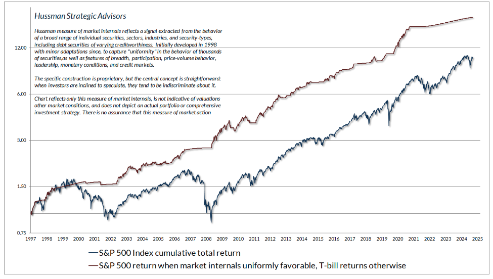
Since speculators tend to be fairly indiscriminate, and increasing selectivity has historically preceded the most severe market losses, our most reliable gauge of speculation versus risk-aversion is the uniformity of market internals across thousands of individual stocks, industries, sectors, and security-types, including debt securities of varying creditworthiness.
The chart below presents the cumulative total return of the S&P 500 in periods where our main gauge of market internals has been favorable, accruing Treasury bill interest otherwise. The chart is historical, does not represent any investment portfolio, does not reflect valuations or other features of our investment approach, and is not an assurance of future outcomes.
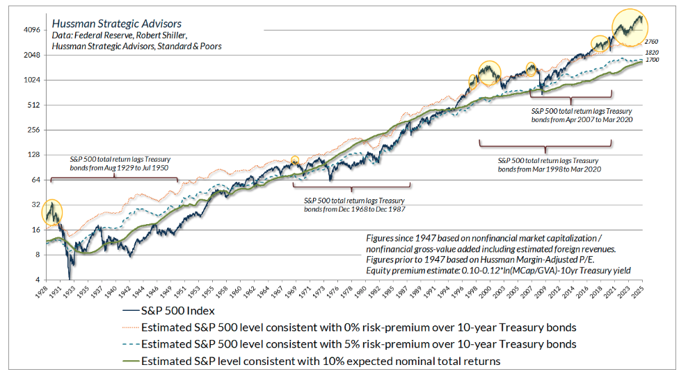
The chart below shows the implications of current valuation extremes in another way. The green line on the chart shows the level of the S&P 500 that has historically been associated with average subsequent 10-year nominal total returns of 10% annually. The dotted blue line shows the level of the S&P 500 that we would associate with a historically run-of-the-mill 5% return above 10-year Treasury yields. The dotted yellow line shows the level of the S&P 500 that we would associate with subsequent S&P 500 total returns no higher than 10-year Treasury yields. The yellow bubbles show periods when valuations were even more extreme.
Not surprisingly, those yellow bubbles were in fact followed by very long periods of time during which the S&P 500 lagged Treasury bonds.
The next chart illustrates what we consider a palatable but not ideal valuation measure: the ratio of the S&P 500 to analyst estimates of year-ahead operating earnings. Among the many problems with this measure (aside from the fact that stocks are a claim to decades and decades of future cash flows, not just next year’s earnings) is that it’s got no history prior to the 1980’s, and only became popular in the 1990’s. So when you hear analysts talk about any sort of “norm” for the price/forward operating earnings ratio, they’re usually restricting their attention to a very small subset of history (often only the past 5-10 years).
Fortunately, the forward P/E has a reasonably good correlation with the Shiller cyclically-adjusted P/E (CAPE), so we can use very long history of the CAPE to impute the likely historical behavior of the forward P/E, had data actually been available. The chart below should make it clear that current valuation extremes, even on this measure, rival the most overextended instances in U.S. financial history.
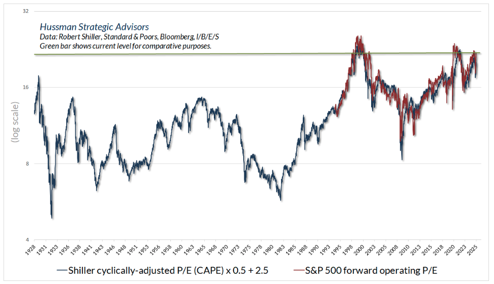
It’s tempting to imagine that somehow valuations have become irrelevant or less useful than in the past, because average valuations have been higher in recent decades than they were historically. What this conclusion misses is that the mapping from valuations to subsequent returns remains intact. Extreme valuations have still been followed, on average by poor returns. Depressed valuations have still been followed, on average, by outstanding returns.
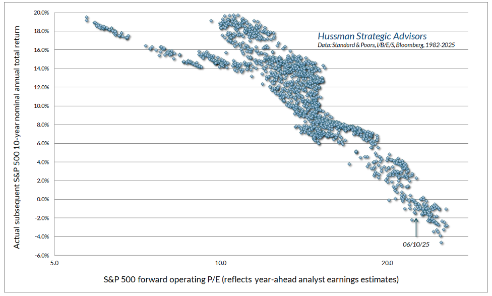
Notice that even in data since the 1980’s, there is a clear diagonal mapping from valuations to subsequent market returns. Presently, the S&P 500 price/forward earnings ratio is consistent with likely 10-year S&P 500 total returns of about zero, with low single digit returns being the optimistic case.
What the higher level of valuations of recent decades have actually done is to steepen the relationship between starting valuations and subsequent returns. Valuations at the end of a given investment horizon have tended to be higher, on average, so that any given starting valuation has mapped to a higher subsequent return. Yet extreme valuations have typically still been followed by reversion to less extreme valuations. Even when more normal valuations emerged years later, and didn’t completely wash out the extremes, poor overall returns still emerged over time.
The chart below illustrates how that works. The scatter for MarketCap/GVA is partitioned in two clusters: 1928-1998, and 1998-2025. This may help to clarify what’s going on. In particular, extreme valuations have still been associated with poor outcomes, on average. Depressed valuations have still been associated with strong subsequent returns.
One can debate whether the higher valuations during the “bubble era” represent a permanent structural change or simply an artifact of elevated profit margins as a result of fiscal interventions and artificially depressed interest costs – it’s probably clear where we stand on that question (more below). Still, the bottom line is that valuations continue to matter. More importantly, variation in the level of valuations still remains informative about subsequent returns.

Structural economic drivers
While one might imagine that profound society-changing innovations in recent decades – like the internet, smartphones, mobile apps, social media, cloud computing, e-commerce, broadband, and personal genomics – would have massively increased U.S. real GDP growth, the fact is that real GDP growth since 2000 has been slower, not faster, than real GDP growth during the 50-year period preceding 2000.
Part of that decline has been due to slower demographic labor force growth, but we’ve also seen slower, not faster, productivity growth despite the profound technological innovations since 2000.
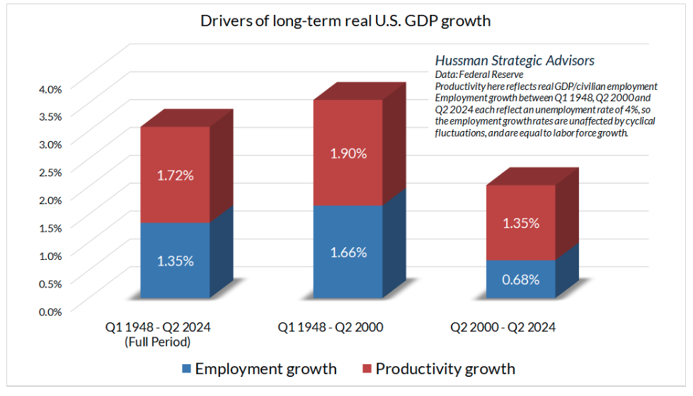
As a result, what I call “real structural GDP growth” (GDP growth excluding the impact of cyclical fluctuations in the unemployment rate) has averaged just 2.2% annually over the past decade.
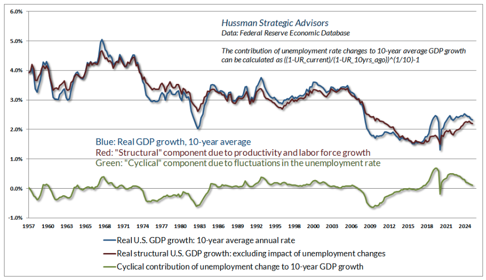
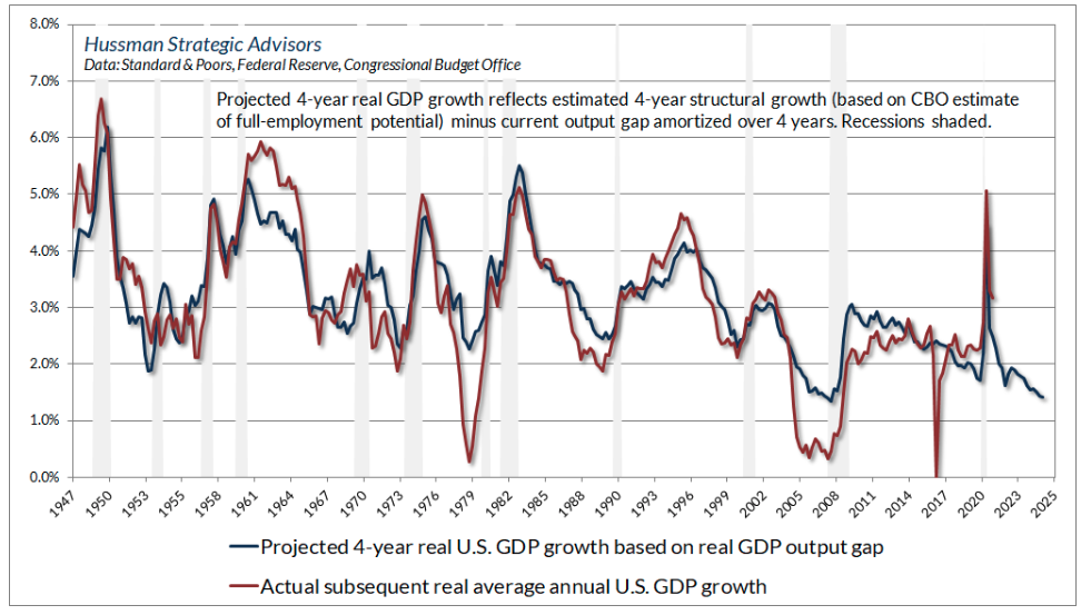
Even that estimate benefits from the fact that U.S. real GDP stands about 1.2% above the CBO estimate of potential GDP. Given that these “output gaps” typically resolve over a small number of years, our baseline estimate for 4-year U.S. GDP growth – barring a recession – works out to an annual rate of just 1.8%.
There’s certainly some hope that AI will boost that figure, but keep in mind that even a full restoration of pre-2000 productivity growth would boost growth by only 1% annually. Given an aging U.S. population, coupled with an openly nationalistic and authoritarian policy climate that’s quite hostile to immigration – despite about 50% of U.S. agricultural workers being undocumented, with others honorably serving in construction, child care, elder care, landscaping, sanitation and many roles that are not widely sought after – it will be difficult for U.S. GDP growth to average even 3% annual growth over the coming 4-year period, even barring any recession.
Still, one might imagine that at least the companies at the forefront of a “new era” will prove to be rewarding even if overall economic growth is limited. That’s certainly possible, but it’s useful to keep in mind that starting valuations play an enormous role.
Recall that the tech-heavy Nasdaq 100 lost -83% of its value during the 2000-2002 collapse (matching the seemingly implausible estimate I offered in March 2000). Moreover, the three largest tech stocks at the end of 1999 by market capitalization – Microsoft, Cisco, and Intel – averaged total returns of just 4.2% annually in the 25 years since 1999. Meanwhile, total returns for Amazon have been substantially lower than its revenue growth rate, while total returns for Apple have substantially exceeded its growth rate. Why? Starting valuations matter. For a full discussion, see the section titled “A note on new eras, mega-cap stocks, and ‘premium’ valuations” in The Turtle and the Pendulum,
So if economic growth has been slower since 2000 than during the preceding 50 years, why have corporate profit margins expanded? The answer isn’t innovation or productivity growth. It’s the combination of massive deficits in other sectors, and low interest costs that resulted from persistently falling interest rates. Statutory corporate tax rates have also declined somewhat, but the impact of that change on actual taxes paid is far smaller. Indeed, the largest impact of tax cuts on corporate margins had already occurred by the early 1980’s (see Universal Capitulation and No Margin of Safety).
The deficits of one sector emerge as the surplus of another
Let’s unpack a key feature of economics – it’s not a theory, just an accounting identity: The deficit of one sector (where spending on consumption and net investment is greater than the income of that sector) always emerges as the surplus of other sectors (where their income exceeds their consumption and net investment).
From an equilibrium standpoint, the sectors running surpluses provide the goods and services that are used or consumed by the sectors running deficits. Meanwhile, the sectors running deficits issue IOUs or transfer cash or securities to the sectors running surpluses – in order to pay for the extra goods and services they get for the purpose of consumption and net investment.
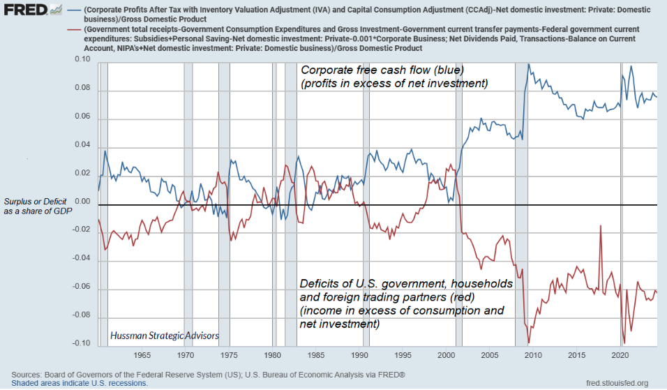
Consider, for example, corporate free cash flow (corporate revenue minus spending and net investment). If corporations are running that surplus, it must be true that other sectors – government, households, and foreign trading partners – must be running deficits (where their consumption and net investment exceeds their income). I know people don’t think of it this way, but from an equilibrium standpoint, this is exactly what’s going on. The massive increase in corporate free cash flow is literally the mirror image of deficits in other sectors.
It should not be a surprise – though I suspect it will be a surprise – that the U.S. current account balance (the “trade deficit”) works exactly the same way. For completeness we’ve got to include not just trade in goods and services, but the smaller impact of net investment income and transfers like foreign aid, but the big number is the trade surplus or deficit. If foreign countries are running a surplus (= the U.S. is running a current account deficit) it must be true, in equilibrium, that U.S. domestic sectors (government, households, and corporations combined) must be running a deficit, where their consumption and net investment exceeds their income.
This is, because that is. The chart below shows what that looks like. The blue line shows the U.S current account deficit (primarily the “trade deficit”) as a percent of GDP. The red line shows the total saving (in this case negative) of U.S. government, households, and corporations over-and-above their net investment.
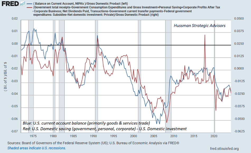
Notice that our trade deficit often “improves” significantly during recessions. That’s equivalent to saying that our “domestic savings-investment gap” narrows. That’s because U.S. domestic investment on capital goods, housing, and inventories typically shrinks. That decline in real investment tends to account for most of the economic contraction during a recession.
At some point in the next few years, I expect we’ll see a striking “improvement” in the U.S. trade deficit. It will happen during a recession, and it will happen not because of tariffs, but because the gap between domestic saving and domestic investment has narrowed due to a decline in investment. Unfortunately, the quickest way to “improve” the trade deficit is to send the economy into a recession.
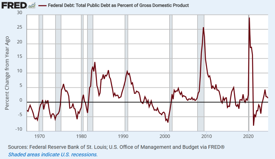
So it should be clear that much of the expansion in corporate profits, particularly in recent years, has been driven by steep deficits in other sectors. On the government side, from 2016 through 2020, $8.4 trillion in new 10-year deficit spending was approved – a combination of tax cuts and net spending increases, with about $3.6 trillion of that related to pandemic response. From 2020 through 2024, another $4.3 trillion in 10-year deficit spending was approved, about $2.1 trillion of that being pandemic response (Committee for a Responsible Federal Budget).
Yes, we’ve got an aging population, which has increased Medicare spending, and yes, more families have access to health coverage through Medicaid, including the unemployed and working poor that previously had no option but emergency rooms – which raises costs indirectly. But it’s not the supplemental nutrition assistance program (SNAP), or even Medicare and Medicaid, that have exploded the deficit. It’s huge one-offs that spike the Debt/GDP ratio – including massive tax cuts, multi-year military operations, and massive spending or bailout packages – particularly during recessions and crises. We can go ahead and imagine we can fix this all by taking food out of the mouths of children, taking health care out of the lives of the working poor, and extending more tax cuts – mainly to high income Americans. But I’m kind of a math guy, and as Rev. Raphael Warnock puts it “The math ain’t mathin'”.
In the chart below, it’s worth recognizing that nominal GDP rarely falls on a year-to-year basis, even during recessions. So the spikes really do reflect explosive deficits during recessions and crises. That’s part of the reason I’m so anti-bubble with regard to Fed policy. The collapse of a bubble invariably spikes Debt/GDP.
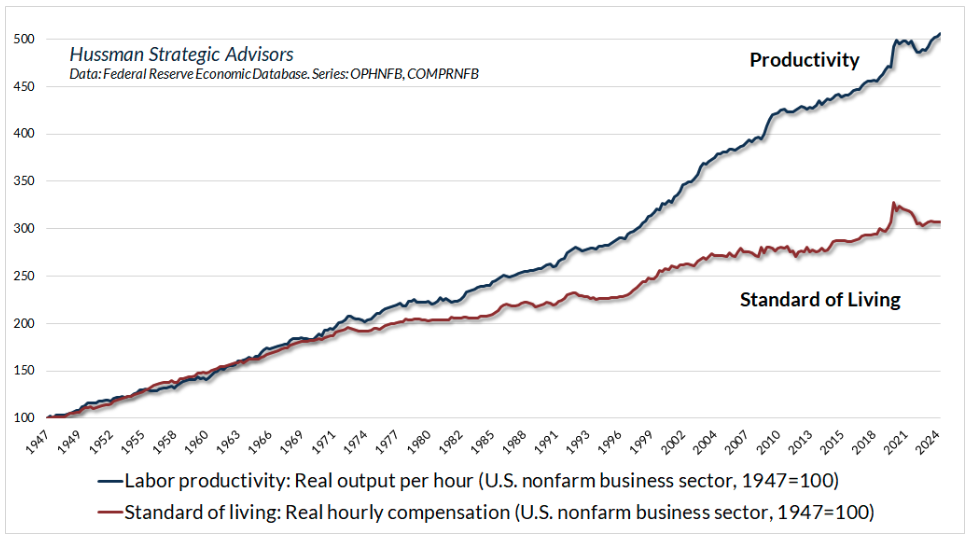
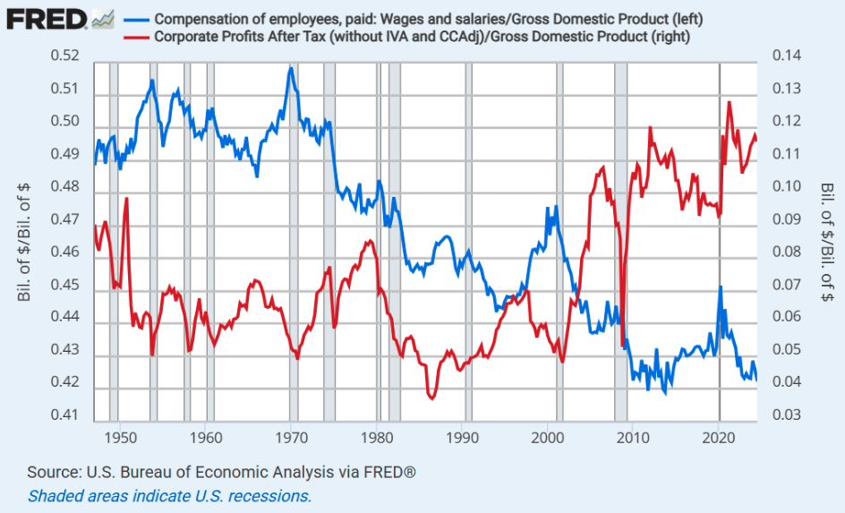
Meanwhile, income growth among households in recent decades has persistently fallen short of labor productivity. Put another way, working families don’t receive the full benefit of their productivity growth, while corporate profits benefit from the difference. That’s not a political statement – it’s just an economic fact.
Not surprisingly, then, the relative profile of wages and salaries versus corporate profits – as a share of GDP – looks like this.
In the financial markets, the way we square this big circle is for the deficit sectors to issue financial liabilities (consumer debt and Treasury obligations) and the surplus sectors to accumulate them. It doesn’t have to be this way, but it is, and many good, well-meaning people seem to be ok with that. Somehow many of us have become content to blame those who don’t have enough to justify policies that would allow those who are already well-off to accumulate more. Ok, that one is clearly a political statement, but it’s also just math.
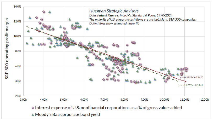
To put a bow on the subject of profit margins, recall the simple fact that U.S. nonfinancial profit margins – before interest and taxes – haven’t demonstrated any meaningful trend for the past 75 years. See, for example, the discussion of “new eras” in Ring Out Wild Bells. That leaves interest and taxes to do the heavy lifting. On that front, the primary driver of rising margins has been the persistent decline in interest rates from their extremes in the early-1980’s. This is particularly true because corporate debt has also increased, providing additional operating leverage as rates declined.
The chart below summarizes more extensive analysis that can be found in prior comments. The vertical axis shows the S&P 500 operating profit margin, in data from 1990-2024. The red dots show the relationship between interest expense as a share of revenues versus S&P 500 margins. The green triangles show the relationship between Baa corporate bond yields versus S&P 500 margins. Both scatters illustrate the same point in different ways.
The bottom line is that while Wall Street seems very eager to promote “new era” narratives to justify the most speculative valuations in U.S. financial history, we should be careful to look more deeply, in order to see that this is, because that is.
Again, nothing in our discipline relies on a collapse in valuations or any specific forecast. That’s particularly true given our adaptations in recent years, and the hedging implementation we introduced last September. We do prefer fluctuation to narrow ranges, because it creates more opportunities, but while I seriously believe the S&P 500 is breathtakingly higher than the level from which one could expect satisfactory long-term returns, one would be reading my work wrong to imagine that we rely on any forecast or scenario involving these risks.
Borderline recession
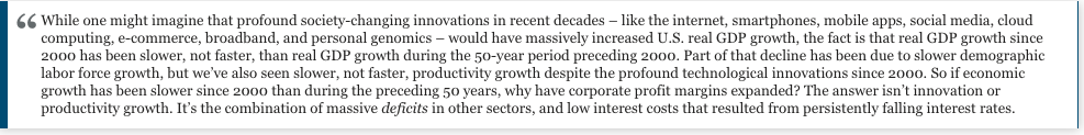
Given that our Recession Warning Composite tilted negative in April, I should note that economic risks persist, but investors also seem clearly interested in “looking over the valley” to perceived benefits of deregulation and further tax reductions.
It may offer clarity to ask “deregulation of what?” and “tax cuts for whom?” As I noted in my January memorial to my friend and mentor Jimmy Carter, not all deregulation is the same. Carter deregulated the airline, trucking, railroad, and telecommunications industries, in a way that reduced government controls on ticket prices, freight rates, routes, service offerings, and market entry, increasing competition while also maintaining consumer protections, safety standards, universal service, and antitrust oversight. A very different type of “deregulation” excites Wall Street today, precisely because it promises to remove such protections.
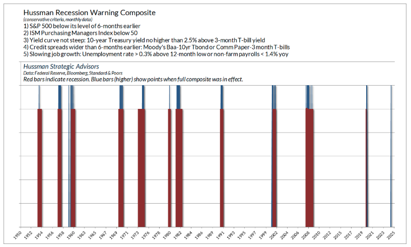
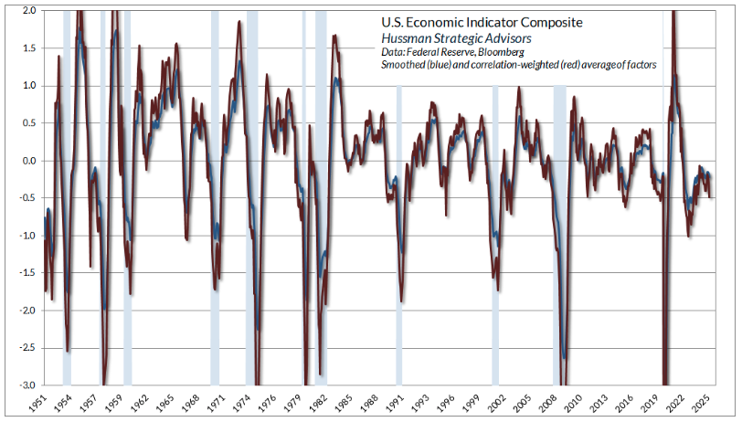
However one views these prospects, our most reliable gauges of economic activity continue to hover near the threshold of recession, but have not crossed Rubicons that have only been seen during recession.
The chart below shows our Order Surplus gauge, based on regional and national surveys from the Federal Reserve and purchasing managers. This gauge tends to precede the headline output number by about 3 months.
The next chart is a much broader gauge based on dozens of measures of economic activity. Once a recession is underway, this gauge can plunge very quickly. For now, again, the best characterization is “borderline,” though with the additional consideration that our long-serving Recession Warning Composite leans toward the expectation of oncoming recession.
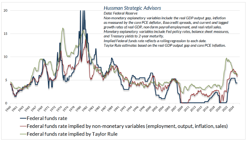
With regard to Federal Reserve policy, it’s often suggested that monetary policy remains very tight. From the standpoint of systematic benchmarks including the Taylor rule and our own estimates, that’s not really true. It’s clear that as inflation has cooled and unemployment has ticked higher, the benchmarks have been in a downtrend, so it would not be a surprise if the Fed cut rates in line with that cooling – even though the Fed Funds rate is already below those benchmarks. Still, aside from short-lived pops, rate cuts tend typically don’t provide durable support to stocks when our gauge of market internals is negative. That’s how the market could plunge in 2000-2002 and 2007-2009 despite repeated and aggressive Fed easing the whole way down.
While the May employment report was broadly considered to be a positive surprise, the headline numbers were clearly better than the reality. The headline showed job growth of 139,000 in May. But this figure was accompanied by downward revisions of -95,000 jobs in the prior two months, resulting in a May jobs number just 44,000 higher than what we thought they were in April. Similarly, the headline index of aggregate hours worked was 124.4 in May, up 0.1. But this figure was accompanied by downward revisions of -0.4 in the prior two months, so the reported figure for May was actually down -0.3 from what we thought it was in April.
As for inflation figures, there are some base effects that will affect year-over-year figures in a way that’s likely to leave them flat or higher over the coming 3 reports. It will be helpful to keep that in mind as the reports come out.
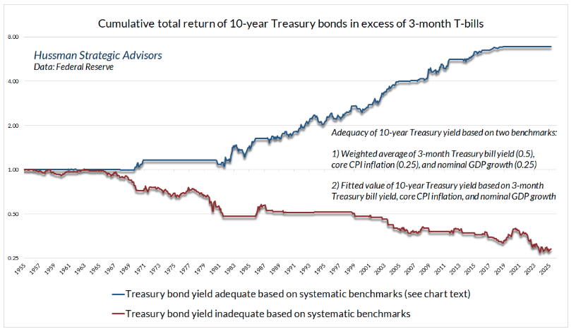
In bonds, I continue to view 10-year Treasury yields as adequate relative to our simple benchmarks that combine Treasury yields, nominal GDP growth, and core inflation.
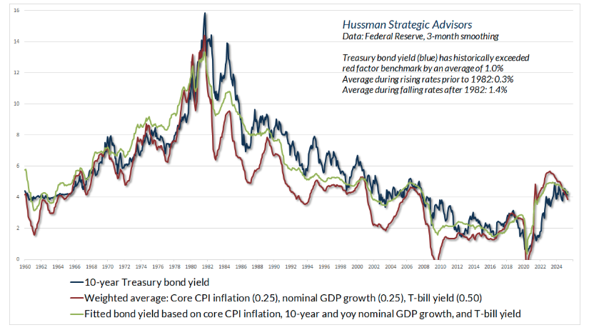
Our actual investment discipline in bonds uses a much broader set of tools, but even this simple “adequacy” comparison has historically provided clear separation between periods when bonds tend to outperform Treasury bills, and periods when they lag. Despite uncertainties related to deficits and foreign investment, our broad view is that Treasury yields are adequate, and we’re comfortable with a constructive stance there.
Finally, Treasury yields remain slightly higher than they were say, 6 months ago, our general view on precious metals, which is informed by a much broader set of measures, remains constructive as well. A clear decline in Treasury yields, coupled with further economic weakness, would likely amplify that constructive view, as precious metals shares tend to reflect a positive return/risk profile under those conditions. For now, consider our broad view to be unfavorable toward stocks, and constructive toward bonds and precious metals. Those outlooks will change as observable, measurable conditions change.
A final thought, amidst it all
Three years ago, at the age of 95, my beloved teacher and friend Thich Nhat Hanh, a Vietnamese Buddhist monk, continued on – as the gentle, peaceful voice in a million hearts, as a bird, a little yellow flower, a cloud, and a cup of tea.
Thay (for “teacher”) often said that a wave in the ocean doesn’t compare itself to other waves. It doesn’t suffer from a complex – of superiority, or inferiority. Enlightenment, for a wave, is the moment the wave recognizes that it, and every other wave, is also the water.
The same is true of all of us. We’re all woven from this one thread of common humanity. The other person isn’t the enemy. The enemies are hatred, fear, greed, ignorance, dishonesty, and discrimination. All of us are surrounded by ways to immerse and marinate ourselves us-versus-them rhetoric and outrage, whether it’s Fox News or MSNBC. The difficult part is to hold onto our enlightenment – to remember that the other person also suffers, that they are made of the same substance, and that we could very well have been them, but for the circumstances we were born and raised into, and the doors of opportunity that were opened, or closed, along the way.
Two quotes, maybe to meditate on for a bit, or do with what you will. They’re not about the markets, but you all know by now that I don’t separate “business” from what is so deeply personal as human rights, compassion, nondiscrimination, and as Thay called it, our “interbeing.”

A message from Advisor Perspectives and VettaFi: To learn more about this and other topics, check out some of our webcasts.
Disclosure Notice
Performance data quoted represents past performance. Past performance does not guarantee future results. Investment return and principal value of an investment will fluctuate so that an investor’s shares, when redeemed, may be worth more or less than their original cost. Current performance may be lower or higher than the performance data quoted. More current performance data through the most recent month-end are available at the Fund’s website www.hussmanfunds.com or by calling 1-800-487-7626.
Investors should consider the investment objectives, risks, and charges and expenses of the Funds carefully before investing. For this and other information, please obtain a Prospectus and read it carefully.
The Hussman Funds have the ability to vary their exposure to market fluctuations depending on overall market conditions, and they may not track movements in the overall stock and bond markets, particularly over the short-term. While the intent of this strategy is long-term capital appreciation, total return, and protection of capital, the investment return and principal value of each Fund may fluctuate or deviate from overall market returns to a greater degree than other funds that do not employ these strategies. For example, if a Fund has taken a defensive posture and the market advances, the return to investors will be lower than if the portfolio had not been defensive. Alternatively, if a Fund has taken an aggressive posture, a market decline will magnify the Fund’s investment losses. The Distributor of the Hussman Funds is Ultimus Fund Distributors, LLC., 225 Pictoria Drive, Suite 450, Cincinnati, OH, 45246.
The Hussman Strategic Market Cycle Fund has the ability to hedge market risk by selling short major market indices in an amount up to, but not exceeding, the value of its stock holdings. However, the Fund may experience a loss even when the entire value of its stock portfolio is hedged if the returns of the stocks held by the Fund do not exceed the returns of the securities and financial instruments used to hedge, or if the exercise prices of the Fund’s call and put options differ, so that the combined loss on these options during a market advance exceeds the gain on the underlying index. The Fund also has the ability to leverage the amount of stock it controls to as much as 1 1/2 times the value of net assets, by investing a limited percentage of assets in call options.
The Hussman Strategic Allocation Fund invests primarily in common stocks, bonds, and cash equivalents (such as U.S. Treasury bills and shares of money market mutual funds, aligning its allocations to these asset classes based on prevailing valuations and estimated expected returns in these markets. The investment strategy adds emphasis on risk-management to adjust the Fund’s exposure in market conditions that suggest risk-aversion or speculation among market participants. The Fund may use options and futures on stock indices and Treasury bonds to adjust its relative investment exposures to the stock and bond markets, or to reduce the exposure of the Fund’s portfolio to the impact of general market fluctuations when market conditions are unfavorable in the view of the investment adviser.
The Hussman Strategic Total Return Fund has the ability to hedge the interest rate risk of its portfolio in an amount up to, but not exceeding, the value of its fixed income holdings. The Fund also has the ability to increase the interest rate exposure of its portfolio through limited purchases of Treasury zero-coupon securities and STRIPS. The Fund may also invest up to 30% of assets in alternatives to the U.S. fixed income market, including foreign government bonds, utility stocks, convertible bonds, real-estate investment trusts, and precious metals shares.
The Prospectus of each Fund contains further information on investment objectives, strategies, risks and expenses. Please read the Prospectus carefully before investing.
The Market Climate is not a formula but a method of analysis. The term “Market Climate” and the graphics used to represent it are service marks of Hussman Strategic Advisors (formerly known as Hussman Econometrics Advisors). The Fund Manager has sole discretion in the measurement and interpretation of market conditions. Information relating to the investment strategy of each Fund is described in its Prospectus and Statement of Additional Information. A schedule of investment positions for each Fund is presented in the annual and semi-annual reports. Except for articles specifically citing investment positions held by the Funds, general market commentary does not necessarily reflect the investment position of the Funds.
Membership required
Membership is now required to use this feature. To learn more:
View Membership BenefitsSponsored Content
Upcoming Virtual Events View All