Equilibrium and the Dentist in Poughkeepsie
Membership required
Membership is now required to use this feature. To learn more:
View Membership BenefitsWhen we try to pick out anything by itself, we find it hitched to everything else in the universe.
– John Muir, Scottish-born American naturalist and writer
When we think of the word “equilibrium,” a whole range of meanings may come to mind
“Supply equals demand.” (market clearing)
“All deficits and surpluses add to zero.” (accounting identity)
“Things are temporarily stable, with no impetus to change.” (steady state)
“Every action has an equal and opposite reaction” (Newton’s Third Law)
“Nature keeps perfect books. What changes on one side is balanced on the other. Every change in spin, charge, and momentum in one place is exactly accounted for elsewhere, so the totals never change.” (Law of conservation)
“Nothing is lost, nothing is created, everything is transformed. (Lavoisier’s maxim)
The word “equilibrium” is an invitation to recognize that nothing exists by itself, alone. Subject and object are two sides of the same coin – their interaction is a single phenomenon.
Even at the tiniest level of the universe, if we look at the polarization of two entangled photons, the spin of two electrons, or the state of two qubits in a quantum computer, we find that measuring one immediately determines the correlated outcome for the other, even far away, without sending any signal. While there’s no theoretical limit to entanglement, the record distance measured to date was between two entangled photons – separated by 747 miles – which is kinda cool.
All of this may seem very abstract, but we can see that the workings of “equilibrium” pervade even the most ordinary aspects of daily life.
At the most basic level, for example, we realize that there’s no such thing as a buyer putting cash “into” the market without a seller taking that same cash “out of” the market. Every share someone just bought is a share someone else just sold (or issued). The buyer, the seller, and the exchange are inseparable – their interaction is a single phenomenon. Talking about “cash going into the market” is like talking about the sound of one hand clapping.
This month, we’ll examine a whole range of examples involving equilibrium, all of which are directly relevant to current economic and market conditions. First, we’ll review the strikingly lopsided equilibrium that’s emerged across various sectors of the economy. This equilibrium helps to understand the record level of corporate profits in recent years – although the distribution of corporate profits is more closely related to whatever innovations and industries are dominant at any particular point in time.
Next, we’ll examine equilibrium in the securities markets – why prices fluctuate, what “flows” actually mean, and how fundamentals, information, and investor beliefs collaborate to determine prices and trading volume.
We’ll then examine the current insensitivity of investors to valuations, and what aspects of the current speculative bubble can and cannot be well-explained by passive “money flows.”
Finally, we’ll share some perspectives, rooted in finance theory, that help to understand how “glamour” companies gain market capitalization, and the beliefs behind the “bubble on a bubble” that we’ve seen in the information technology in recent years.
We’ll do more than the usual amount of math, because equations impose discipline – allowing us to escape from the muddy trap of hidden assumptions and verbal arguments that can often sound very convincing. If you’re already reaching for an Epi-Pen, don’t worry, just read around the math, and know it’s there to support systematic analysis, so we don’t get caught in the mud. Keep in mind also that various models are there to provide insight – there’s no need for us to “believe” them or to take them literally. The map isn’t the territory. The finger pointing at the moon isn’t the moon. They’re just tools to arrive at insights that can help to understand the economy, the financial markets, and things as they are.
Corporate profits and household deficits
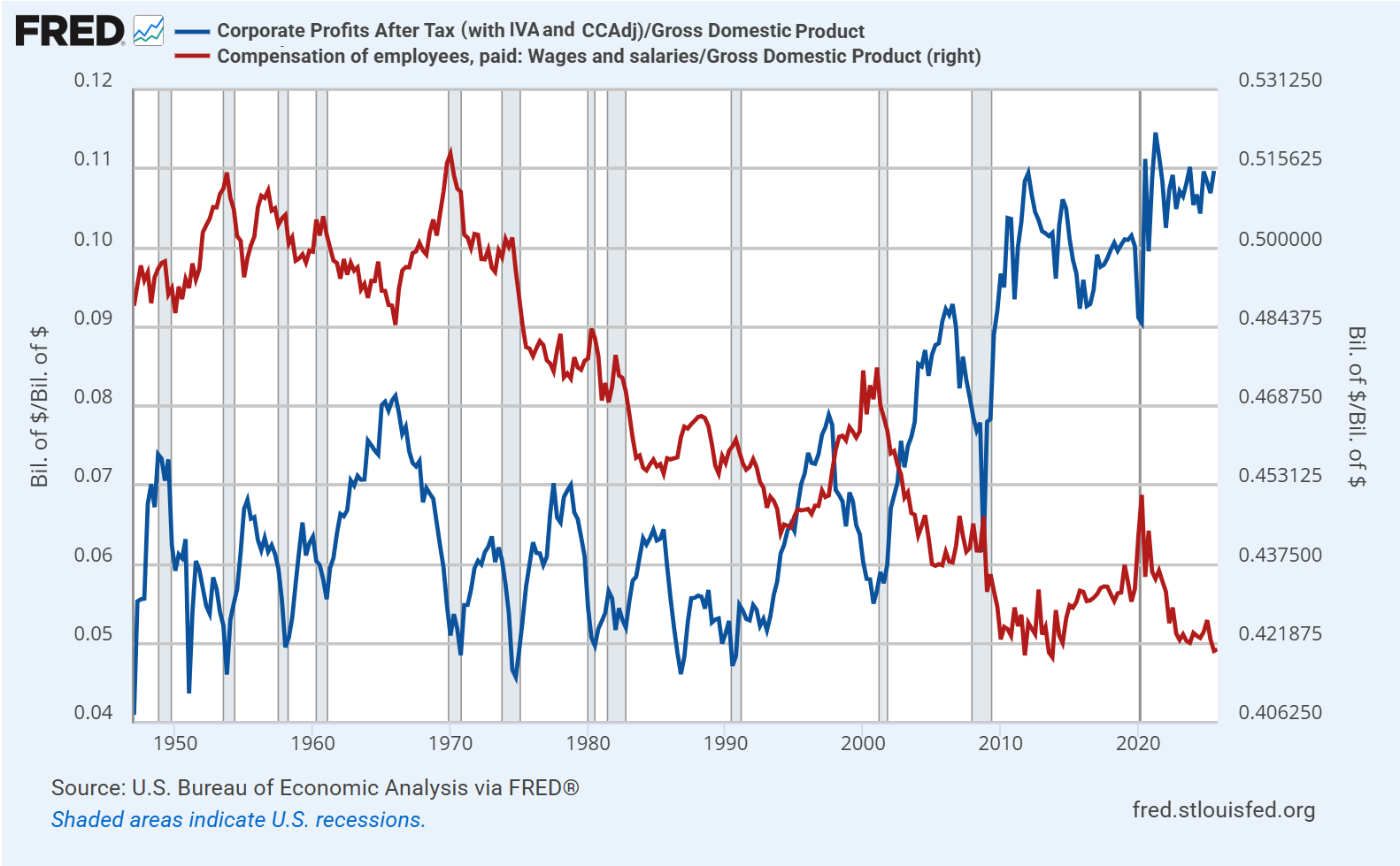
One of the defining features of the present state of the U.S. economy is the striking gap between the prosperity of corporations and profitability on one hand, and the increasingly tenuous financial condition of working families that rely on wage and salary income.
The discussion below expands on the January comment, which focused on the equilibrium that relates record corporate profits – directly, and as an accounting identity – to mirror image deficits in the household and government sectors (see How the Bubble Manipulates Time). Once we understand the causes and conditions that allowed recent record profits to “manifest,” we are also better prepared, and will be less surprised, when things change.
Thinking in terms of equilibrium helps to understand exactly why and how corporate profits have increased to a record share of GDP in recent decades. The reason isn’t growth-enhancing productivity. Since 2000, real U.S. GDP growth has expanded at the slowest 25-year growth rate in U.S. history, despite profound technological change. The main impact of technology has not been to increase economic growth, but to widen the wealth distribution. What’s really going on is so striking that once you see it, you can’t “un-see” it – the deficits of one sector always emerge as the surplus of another.
The chart below shows corporate profits in excess of net investment in blue, with the mirror image deficit of other sectors – primarily households and the U.S. government – in red. The two lines are identical beyond a tiny statistical discrepancy and insignificant items (FRED only allows 15 series in a chart).
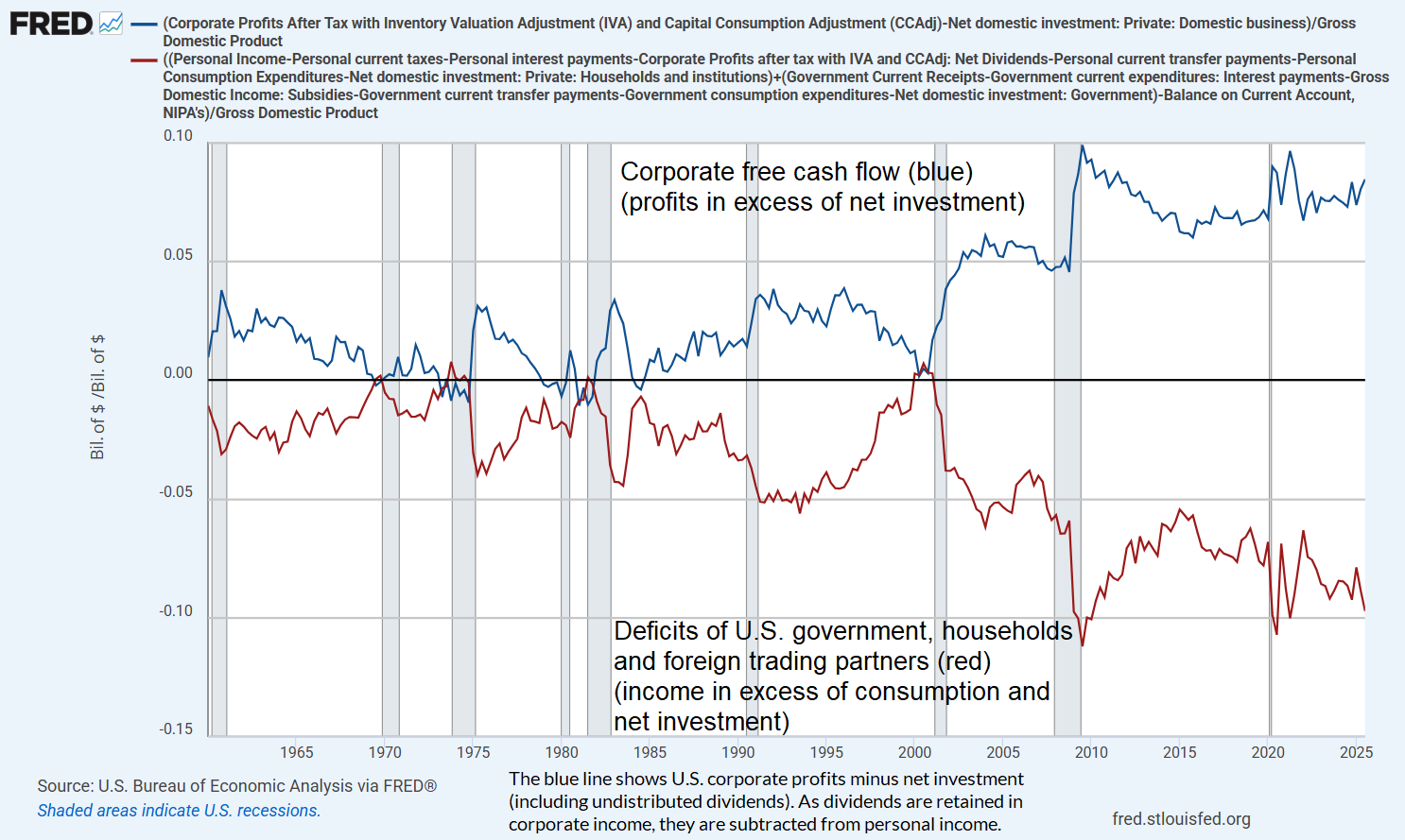
Given that the wealthiest 10% of U.S. households hold 87% of U.S. equities and mutual fund shares, 87% of loan assets (indirectly via claims on banks and other intermediaries), and 79% of debt securities (Data: Federal Reserve Distributional Financial Accounts), this trajectory illustrates the increasingly lopsided equilibrium in the U.S. economy: we see ordinary households struggling, with wage and salary income at the lowest share of GDP in history, while corporate profits and the wealth share of the top 10%, 1%, and 0.01% of households stands at unprecedented extremes.
Yes, it’s an equilibrium, but it’s a bonkers equilibrium. And it is also a policy choice. The simple fact is the corporate profits and financial gains – new income, new money, new wealth to the receivers – are taxed at wildly lower combined rates than wages and salaries. Indeed, many of the wealthiest households receive most of their compensation in stock, with the dilution offset by corporate stock buybacks (which avoids being taxed as dividends). They borrow against that stock in order to consume, while the gains can be deferred almost forever, making the present discounted value of the future tax liability close to zero.
There’s an argument that a low tax on financial “capital” (stocks and bonds) encourages productive investment (physical investment – the “I” in the GDP equation), but this is a terribly indirect way of doing it. It would be more efficient and less distorting to equalize combined tax rates between wages and salary income and financial income, while broadening the payroll tax base, lowering payroll tax rates, and using investment tax credits and accelerated depreciation to sustain real, productive investment directly.
By equalizing “combined tax rates”, I mean the combined impact of corporate taxes and taxes on the resulting investment returns (dividends + capital gains) on one hand, and the combined impact of income taxes on wages and salaries and the associated payroll taxes on the other. You remove the distortion by taxing a dollar of income as a dollar of income regardless of source, rather than skewing the code against wage and salary income. Broadening the base also allows you to lower the rates. You directly encourage investment and innovation, well, by encouraging it directly.
Meanwhile, we continue to see massive “natural monopolies” – companies that benefit from network effects and hyperscale (an uncompensated public good created by the very customers that act as hubs in the network). Similarly, tools like AI can be remarkably useful, but they are built by scouring the publicly available work, research and writing of countless people who go uncompensated, and the role of these technologies in improving productivity can come at the cost of displacing workers. These individuals still have to eat, support their families, retirement, and get health care, so they issue liabilities, or receive transfer payments funded by government liabilities, all of which are accumulated by households at the top of the income distribution.
Here, my own proposal would lean toward taxing the portion of corporate receipts that behave as “dominance rents” without fostering either employment or investment. An example of that definition would be gross value added, minus a per-worker allowance for wages paid (capped at, say, $150k each), minus a normal return allowance (a common benchmark return times the company’s actual base of real capital investment and R&D). This way, even if all human work is eventually replaced by a single corporation’s self-replicating AI robot toasters, humanity will not be in the position of borrowing from the one guy who owns the company, in order to consume the output generated by that company.
All of this is a choice. When you give a tax preference to a given activity or form of income, you get more of it, and that includes extreme wealth. When you create a tax disincentive, you get less of it, and that includes wage and salaries of working families. The point here isn’t to disparage anyone, only to observe that this is, because that is. We can certainly make policy choices that treat a dollar of income as a dollar of income, regardless of the source, while still encouraging productive investment, capital formation, jobs, and innovation.
We can understand the underlying condition of the U.S. economy only if we understand the equilibrium that we’ve allowed and even encouraged in recent decades.
Total income and total output are equal, but distributed in wildly different ways
There are two ways to calculate Gross Domestic Product (GDP) – the value of the nation’s economic output. One way is to add up the value of all goods and services that are produced by the economy (whether those goods and services are used for consumption, capital investment, or even unintended and unsold inventory). The other way is to add up all of the income received by every sector of the economy, including consumers, businesses, government, and in an open economy, foreign trading partners who sell us goods and services. Apart from a small “statistical discrepancy,” these two definitions of economic activity – the output and income definitions – are equivalent.
Suppose that working families help to produce the total output of the economy, but their wages and salaries fall short of the amount that they actually need in order to finance their consumption, living needs, health care, and retirement expenses. Well, for these families (about 90% of American citizens), their spending on consumption and net investment will be greater than their income. They finance that shortfall either by issuing liabilities directly (consumer loans, credit card debt, mortgage obligations), or by receiving government funds (social security, medicare, medicaid, SNAP, and other transfers, which amount to about two-thirds of all Federal spending). If government runs a deficit, it finances those transfers by issuing its own liabilities, as Treasury securities and monetary instruments.
It must then be true, in equilibrium, that the remaining sectors have received income above and beyond what they spent on consumption and net investment. Why? Because under the two identical definitions of GDP, total income is equal to total output (consumption and net investment, including inventories, whether intended or unintended). If one sector runs a shortfall, the others must run a mirror-image surplus.
As we saw in the January comment, the result over the past two decades is that the wealthiest 10% of American households have persistently accumulated an enormous amount of “savings” – which primarily take the form of newly issued liabilities of government and 90% of U.S. households. The U.S. economy is quite literally balanced on the back of working families and the Federal transfer payments that bridge the gap between household income and spending.
The chart below shows the total assets of the top 1% of U.S. households, compared with the bottom 50% of U.S. households, both as a ratio of total U.S. household net worth.
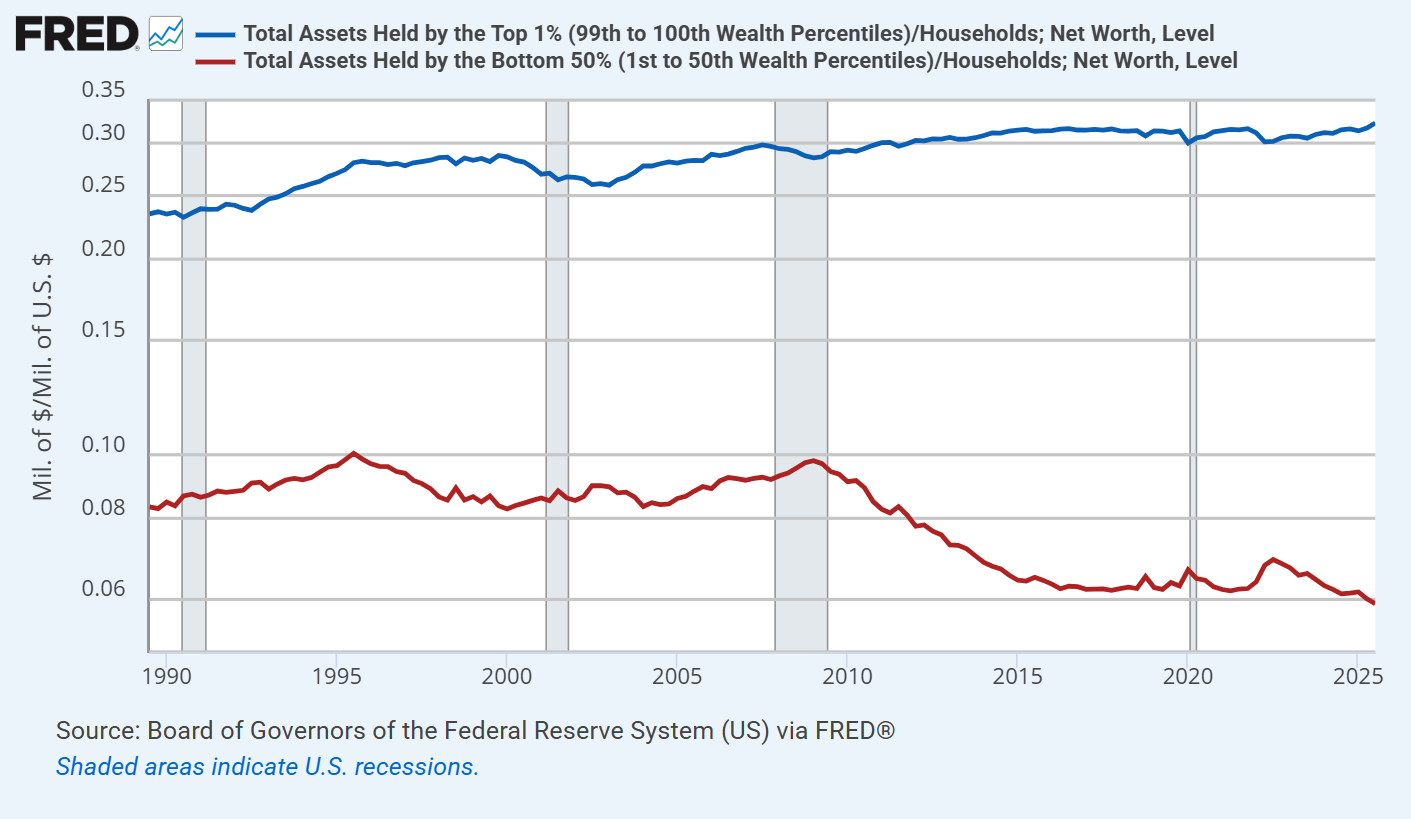
When we look carefully at the interconnectedness of things, we discover that the new “savings” in the U.S. economy always take the form of financial instruments that someone issued in order to finance mirror-image “deficits”. Although these new instruments may include newly issued shares of stock, the fact is that net issuance of U.S. stocks has actually been slightly negative over the past 20 years, meaning that “new savings” haven’t taken the form of stock shares.
Since 2000, the increase in U.S. stock market capitalization has been driven almost entirely by two factors: growth in fundamentals and, far more importantly, rising valuation multiples – not by the creation of new shares. What has increased dramatically is the outstanding debt of households and government. It has increased because our policy choices tolerate and even encourage a dramatic income skew between haves and the have-nots. This is because that is. This is not because that is not.
The deficit of one sector emerges as the surplus of other sectors, and the liabilities issued by one sector become the assets of the other sectors. It’s not just a theory. It’s an accounting identity.
Yes, corporate profits and free cash flow are at record highs. They’re at record highs because government, households and foreign trading partners are running a massive net deficit. The distribution of the corporate profits absolutely reflects scarcity, innovation and – particularly in recent years – “hyperscale” network effects, where single companies operate as dominant providers in their sectors. The level of profits, however, is a sectoral imbalance.
This enormous domestic imbalance between “haves” and “have nots” means that the “haves” accumulate the financial obligations of the “have nots.” That’s how this house of cards keeps standing.
Neither the government nor the average American household is taking in enough income to meet their expenditures. The majority of Federal expenditures are an offset to the fact that U.S. households, in aggregate, don’t earn enough to finance basic needs like healthcare and retirement expenditures. To a large extent, the combined deficit reflects a single underlying dynamic. From an accounting standpoint, record corporate profits are the mirror image of that dynamic.
– John P. Hussman, Ph.D., An Unstable Equilibrium, October 28, 2025
Objective functions
Whenever we talk about “maximizing” something, whether profits, or GDP, or expected returns, or the well-being of ourselves, our communities, or the world, we implicitly or explicitly create an “objective function” that takes certain inputs, like X1, X2 and so on, and converts them into the resulting thing, Y, that will make us happy, and that we want to maximize:
Y = function(X1,X2, …)
We should be careful about how we create our objective functions, for two reasons. One is that whatever we don’t include in our definition of happiness, and give zero weight, will be treated only as a means to our own happiness. We may then exploit or even destroy those things as long as they contribute to our pursuit. That leads to the second reason we need to be careful: there are often unobserved “feedback effects” from one variable to another. If we choose our objective function carelessly, we can actually harm ourselves.
Suppose we want our portfolios to earn high yields over time. We might decide to construct a portfolio made only of high yield securities, not realizing that by maximizing yield alone, we may also maximize the risk of bankruptcy and credit default. If we’re farmers, we might choose to maximize a harvest by bathing our crops in insecticide, inadvertently poisoning both the land, and our bounty of fruit.
The same is true in our daily lives and in our world. If our objective function gives full weight to our own wealth and happiness, and zero weight to the well-being of others, we may create a world where people in our own country and vulnerable populations elsewhere are exploited and discarded as “resources” that contribute to our profit. We might even poison the water we drink, the air we breathe, and the single planet in the cosmos that’s inherently symbiotic with humanity. In that case, our happiness may be made of the suffering of others, and that of our children and grandchildren. There may also be feedback effects – we may see homelessness, poverty, addiction, and social problems around us, without realizing that this is, because that is.
We may see people trying to escape from their condition and enter the U.S., seeking to share in some of our happiness, and we may turn them into enemies without realizing how our choice of objective function has contributed to the situation, or might be changed in ways that alleviate it. If the suffering and desperation of others hardens, we may even see crime, or violence, or hatred directed toward us. None of those things are born whole. They emerge because they are cultivated, sometimes intentionally, and sometimes inadvertently.
Either way, it helps to be aware of what we’ve included in our objective function, and to ask whether we’ve considered the feedbacks. If equilibrium teaches us one thing, it’s that nothing exists by itself alone.
Back to equilibrium in finance, we’ll next ask the question – why do prices change in the financial markets? This will give us a clean and exhaustive set of places to look, which taken together must account for those price changes, by definition.
We’ll then take a look at equilibrium in the stock market – the effect of investors who care about expected returns and risk, and price-insensitive investors who don’t. By the end of this comment, my hope is that it will be clear how such “flows” between buyers and sellers affect the financial markets.
Finally, we’ll examine the “bubble on a bubble” that we’ve observed in the information technology sector, and show the basic condition – “perceived edge” – that largely accounts for the huge share of market capitalization that these companies presently comprise.
The dentist in Poughkeepsie
Why do security prices fluctuate? What moves the market? Is it trading volume, “money flow”, fundamentals, changes in the expectations of investors about return and risk, or some combination?
The answer is that price fluctuations can be equally described in two seemingly different ways. At the base, the price of a given security is whatever the current perceptions, expectations, exuberance, hopes, and fears of buyers and sellers collectively determine the price to be. There’s no stable linear relationship between observable facts and prices. There isn’t even a stable nonlinear relationship. However, once investors collectively determine the price of a security, there is a very robust relationship – sheer arithmetic – that links three objects: the price investors pay, the very long-term stream of cash flows the security will deliver into the hands of investors over time, and the long-term rate of return that investors will enjoy or suffer if they buy the security at the current price.
Let’s begin with an observation about “equilibrium.” If a dentist in Poughkeepsie sells a single share of AAPL at a price that’s 7 cents below the previous trade, a billion dollars of market capitalization vanishes – a billion dollars, on $260 bucks of “flow.” Market capitalization is the outstanding number of shares times price, and price will move to whatever level that’s needed to ensure that someone holds every outstanding share. The marginal investor prices the whole float.
Intuitively, even though our dentist sells only a single share of AAPL, one could argue that other investors wouldn’t allow the stock to drop by even 7 cents unless the most eager buyer got just a bit less eager. That intuition is exactly right. What allows $260 bucks to move the market by a billion dollars is, implicitly, that other investors essentially agree that the price should be 7 cents lower. If some news event changes the collective view of investors about expected returns or expected risk, price can advance or decline sharply on very little volume.
Technically, all that’s needed to wipe out that billion dollars is for bids and offers to change. Once these quotations establish the neighborhood, trading a single share is enough to set the price. At the moment a trade occurs, there’s one price that results in everyone in the market holding every outstanding share of AAPL, and in this case, it’s 7 cents lower than the previous trade.
We can equivalently think about the price movement from the perspective of the arithmetic that links valuations and expected returns. The price change in AAPL tells us one of two things: either the market’s collective expectations for the future cash flows of AAPL have just declined by a tiny bit, or the long-term return that can be expected by the remaining holders of AAPL just increased by a tiny bit. That’s how valuation arithmetic works. One might say that a market where $260 bucks can move market cap by a billion dollars is wildly “inelastic,” but what’s actually going on is that the consensus view of investors has changed a tiny bit.
If a dentist in Poughkeepsie sells a single share of AAPL at a price that’s 7 cents below the previous trade, a billion dollars of market capitalization vanishes – a billion dollars, on $260 bucks of ‘flow.’ Market capitalization is the outstanding number of shares times price, and price will move to whatever level that’s needed to ensure that someone holds every outstanding share. The marginal investor prices the whole float.
It’s sometimes convenient to break the long-term expected return of a security into the sum of a “risk-free” rate and a “risk premium.” That decomposition is conceptual, not an assertion that investors actually do these calculations, but it does allow us to break price fluctuations into exactly three components:
1) Changes in the present level and expected trajectory of fundamentals,
2) The level of return available on risk-free assets (e.g. safe interest rates), and
3) Changes in the amount of compensation that investors require for accepting risk – which depends heavily on their psychology toward speculation or risk-aversion at any given time.
A financial “security” is nothing more than a claim on some stream of cash flows that investors expect to be delivered into their hands in the future. For any stream of future cash flows, and some long-term rate of expected return, we can always calculate the “present value” of the cash flows expected at each point in the future. If the price we pay today is the same as that “present value,” and the expected future cash flows actually emerge, our actual long-term investment return – by definition – will be exactly the long-term rate of return we used to discount the cash flows. For more discussion on this relationship, see the first half of How The Bubble Manipulates Time.
If you consider a world where record government and household deficits have emerged as mirror image corporate profits, while more than a decade of zero interest rates, coupled with speculative exuberance, encouraged investors to drive discount rates and risk-premiums to the lowest levels in history, you can understand why U.S. stock market valuations are at the most extreme levels in history. The problem is that understanding isn’t the same thing as justifying. Current valuation extremes now rely on those government and household deficits to continue forever. Meanwhile, the record low discount rates – reflected in historically extreme valuations – also imply the likelihood of meager long-term stock market returns even if expected cash flows are realized.
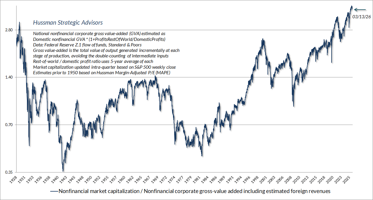
The chart below shows our most reliable gauge of market valuations in data since 1928: the ratio of nonfinancial market capitalization to gross value-added (MarketCap/GVA). Gross value-added is the sum of corporate revenues generated incrementally at each stage of production, so MarketCap/GVA might be reasonably be viewed as an economy-wide, apples-to-apples price/revenue multiple for U.S. nonfinancial corporations.
As I noted in January, over shorter horizons, all that matters is the return in people’s heads. It’s only over time that the cash flows arrive and reliably teach investors that valuations matter. That’s why Ben Graham wrote “In the short run, the market is a voting machine, but in the long run, it is a weighing machine.”
Current market conditions
The way to wealth in a bull market is debt. The way to oblivion in a bear market is also debt, and nobody rings a bell.
– James Grant
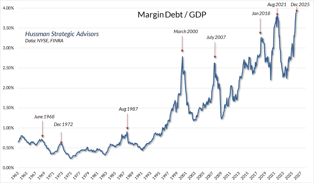
Among the recognizable features of speculative exuberance in recent months is the expansion of margin debt in investor portfolios. As I’ve noted many times over the years, one can normalize margin debt based on a variety of denominators, some more informative than others. For example, it’s tempting to normalize margin debt against market capitalization, but part of the information signal in margin debt is actually valuation, so you’re better off normalizing against measures that are more directly related to cash flows.
The chart below shows the ratio of margin debt to GDP. What matters for this particular measure isn’t the specific level, but the very discrete “spikes” – these tell you something about herd exuberance. My impression is that much of the recent spike is focused on information technology stocks. Historically, these spikes have added a layer of “forced selling” onto the market losses of speculative glamour stocks, as we’ve seen in other episodes. Like many indicators, Margin debt / GDP is best used as part of a broader set of information. The spike we see at present isn’t a powerful indicator in itself, but it does reinforce the signals we see in other areas, particularly valuations.
The overall condition of the U.S. stock market continues to feature near-record valuations and ragged internals. Still, particularly since our September 2024 hedging implementation, shorter-term market behavior can provide numerous opportunities to vary the “intensity” of our hedge, and as I noted last month, we’ve extended that implementation to identify conditions where we can even periodically reverse the hedge to a more constructive position – although unquestionably with a safety net at current valuation extremes. Suffice it to say that while the full-cycle implications of current valuations are still quite unfavorable, but we have no reliance on short-term forecasts or scenarios, since even the tilt of our own investment outlook can change from day-to-day and week-to-week as market conditions evolve.
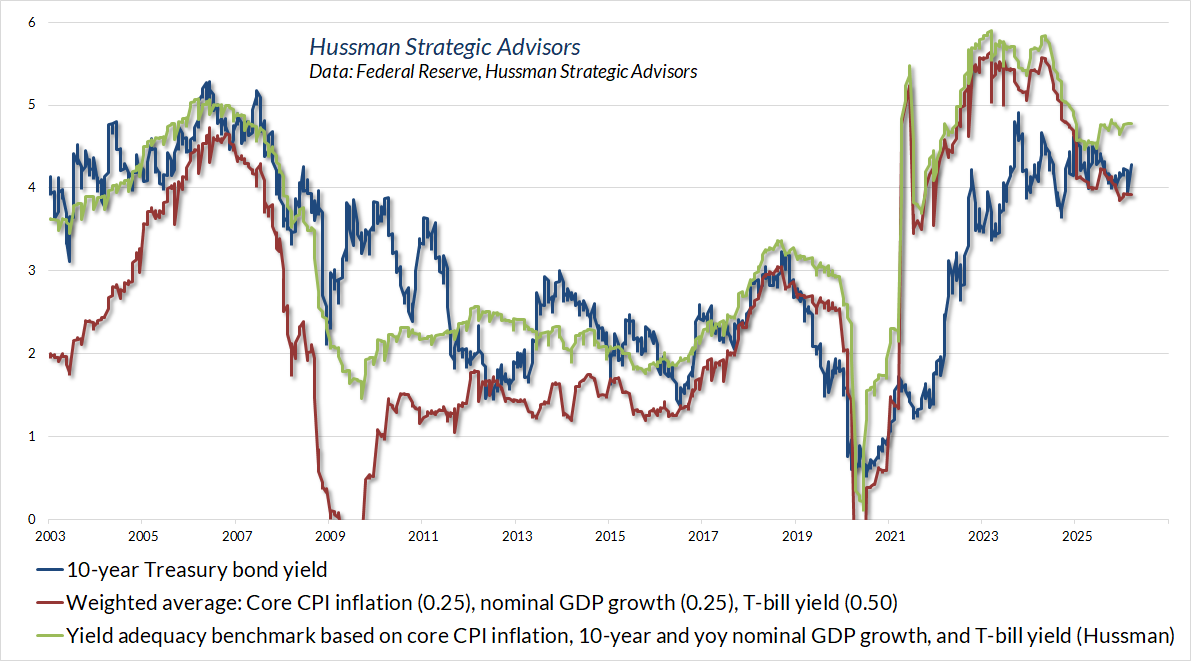
On the subject of debt, Treasury yields have pushed higher in recent weeks, partly in response to concerns about oil prices and prospects for higher government spending and faltering foreign demand for U.S. debt obligations. Even our simpler gauges of yield adequacy suggest that Treasury bond yields remain “meh” – not clearly inadequate, but not at levels where we’ve typically seen Treasury bonds returns reliably outpace T-bill returns. Overall, our bond market view is tepid here, but I expect that will gradually improve if we see a further push higher in yields.
Meanwhile, given that the entire total return of the Philadelphia Gold & Silver Index (XAU) has historically accrued during periods of falling bond yields, gold stocks have not surprisingly struggled amid a combination of rising yields and slightly improved readings from purchasing managers surveys and the like. These conditions will change, but presently our view on the sector is also rather tepid.
The foregoing comments represent the general investment analysis and economic views of the Advisor, and are provided solely for the purpose of information, instruction and discourse.
Prospectuses for the Hussman Strategic Market Cycle Fund, the Hussman Strategic Total Return Fund, and the Hussman Strategic Allocation Fund, as well as Fund reports and other information, are available by clicking Prospectus & Reports under “The Funds” menu button on any page of this website.
The S&P 500 Index is a commonly recognized, capitalization-weighted index of 500 widely-held equity securities, designed to measure broad U.S. equity performance. The Bloomberg U.S. Aggregate Bond Index is made up of the Bloomberg U.S. Government/Corporate Bond Index, Mortgage-Backed Securities Index, and Asset-Backed Securities Index, including securities that are of investment grade quality or better, have at least one year to maturity, and have an outstanding par value of at least $100 million. The Bloomberg US EQ:FI 60:40 Index is designed to measure cross-asset market performance in the U.S. The index rebalances monthly to 60% equities and 40% fixed income. The equity and fixed income allocation is represented by Bloomberg U.S. Large Cap Index and Bloomberg U.S. Aggregate Index. You cannot invest directly in an index.
Estimates of prospective return and risk for equities, bonds, and other financial markets are forward-looking statements based the analysis and reasonable beliefs of Hussman Strategic Advisors. They are not a guarantee of future performance, and are not indicative of the prospective returns of any of the Hussman Funds. Actual returns may differ substantially from the estimates provided. Estimates of prospective long-term returns for the S&P 500 reflect our standard valuation methodology, focusing on the relationship between current market prices and earnings, dividends and other fundamentals, adjusted for variability over the economic cycle. Further details relating to MarketCap/GVA (the ratio of nonfinancial market capitalization to gross-value added, including estimated foreign revenues) and our Margin-Adjusted P/E (MAPE) can be found in the Market Comment Archive under the Knowledge Center tab of this website. MarketCap/GVA: Hussman 05/18/15. MAPE: Hussman 05/05/14, Hussman 09/04/17.
Membership required
Membership is now required to use this feature. To learn more:
View Membership BenefitsSponsored Content
Upcoming Virtual Events View All