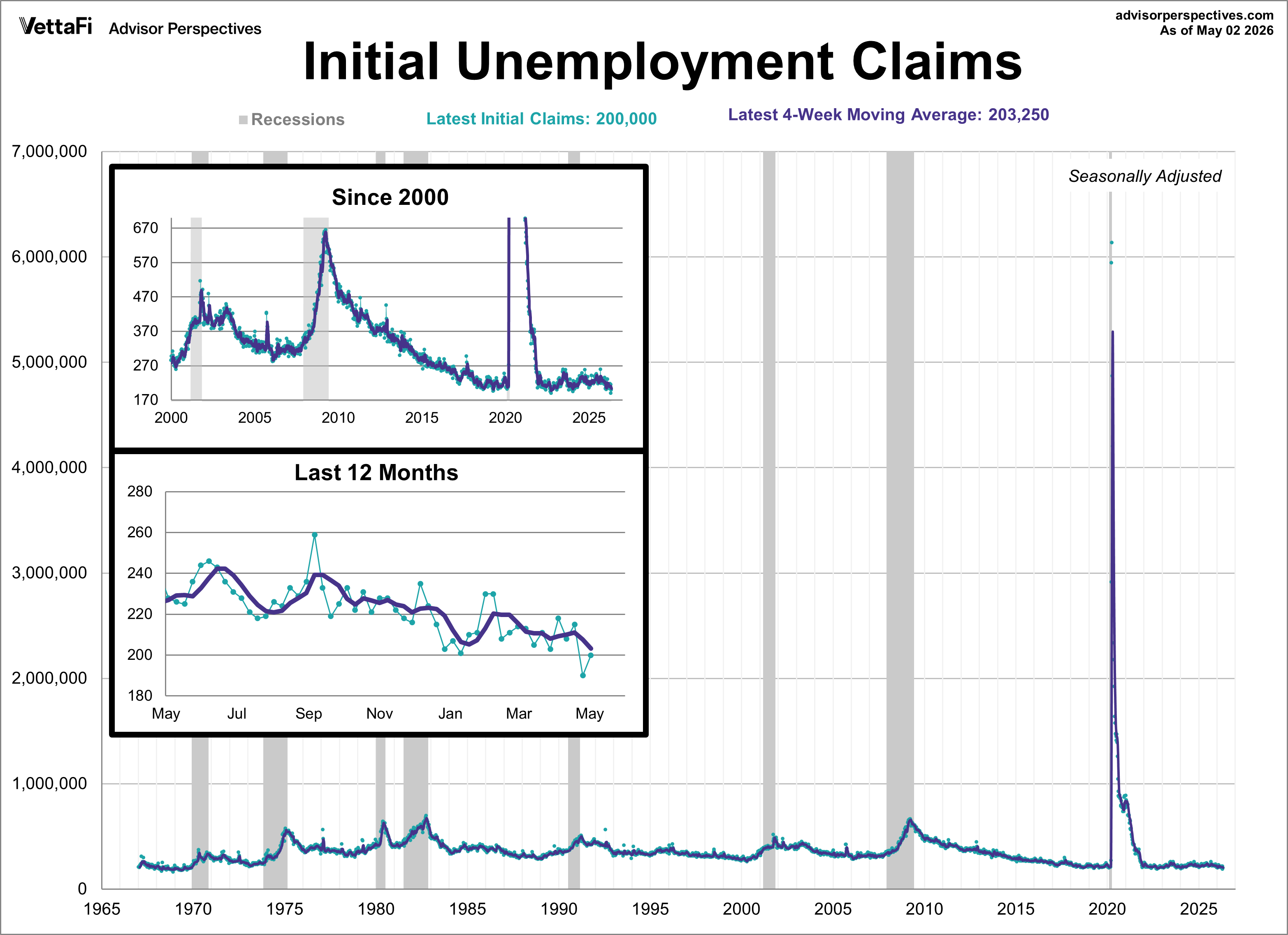
Every week, we provide an update on unemployment claims shortly after the BLS report is made available. While the financial press often reacts to volatile, simplistic weekly estimates, our focus remains on the four-week moving average to identify broader trends.
The Raw Data vs. Reality
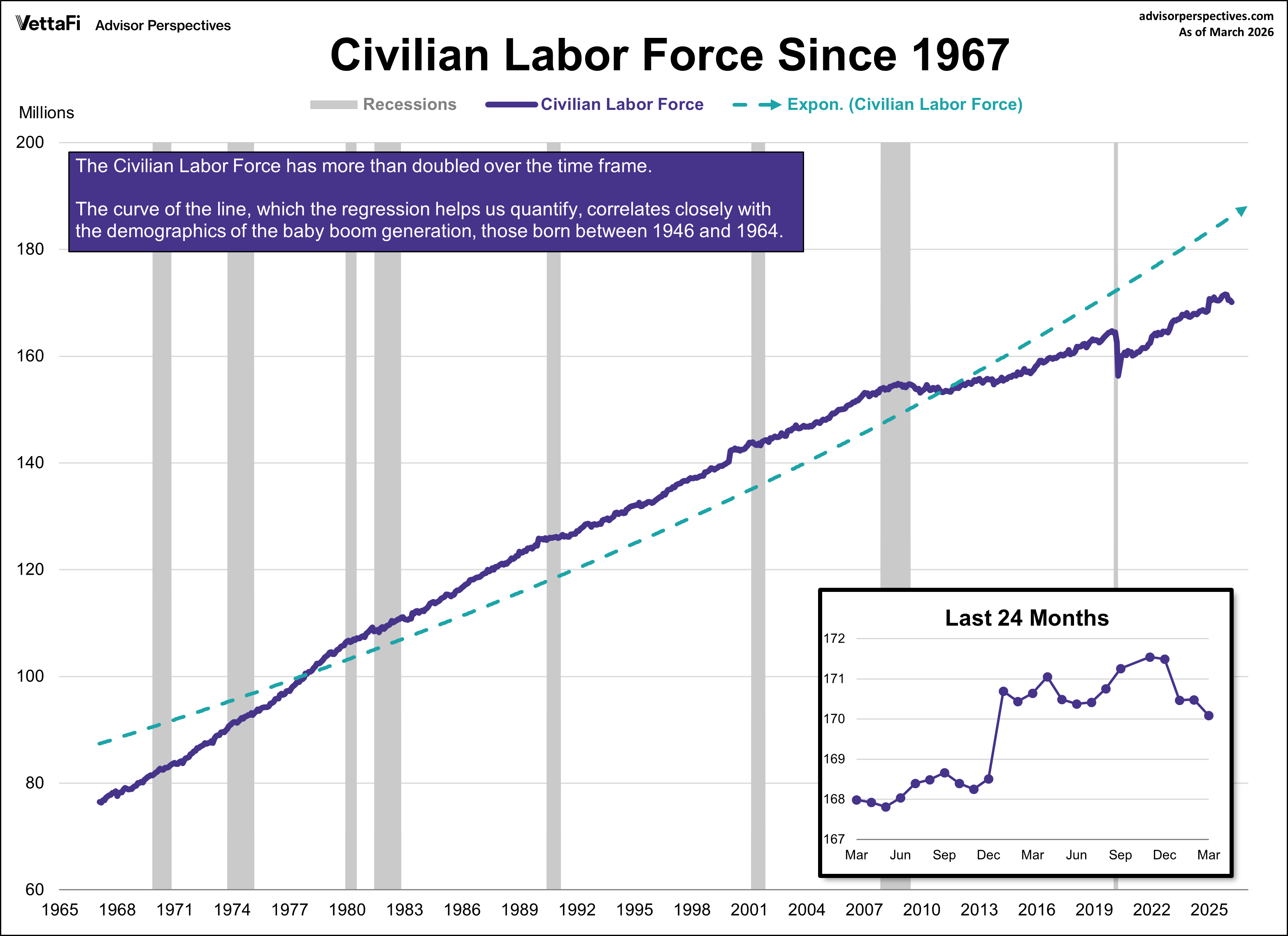
Historically, the four-week moving average rises at or before a recession and peaks as it ends. However, viewing raw, seasonally adjusted numbers can be misleading. To understand the true impact, we must account for the massive growth in the Civilian Labor Force (CLF), which has more than doubled from 76.5 million in 1967 to nearly 170 million today.
What is the Civilian Labor Force (CLF)?
The civilian labor force (CLF) is the total number of working age people (16 and over) who are either employed or unemployed. It does not include military personnel, federal government employees, retirees, institutionalized individuals, agricultural workers, handicapped people, or "discouraged" workers. The curve of the line, which the regression helps us visually quantify, largely reflects the employment demographics of the baby boom generation, those born between 1946 and 1964. In 1967 they were starting to turn 21. The oldest are currently eligible for full retirement benefits. Another factor in the curve is the rising participation of women in the labor force.

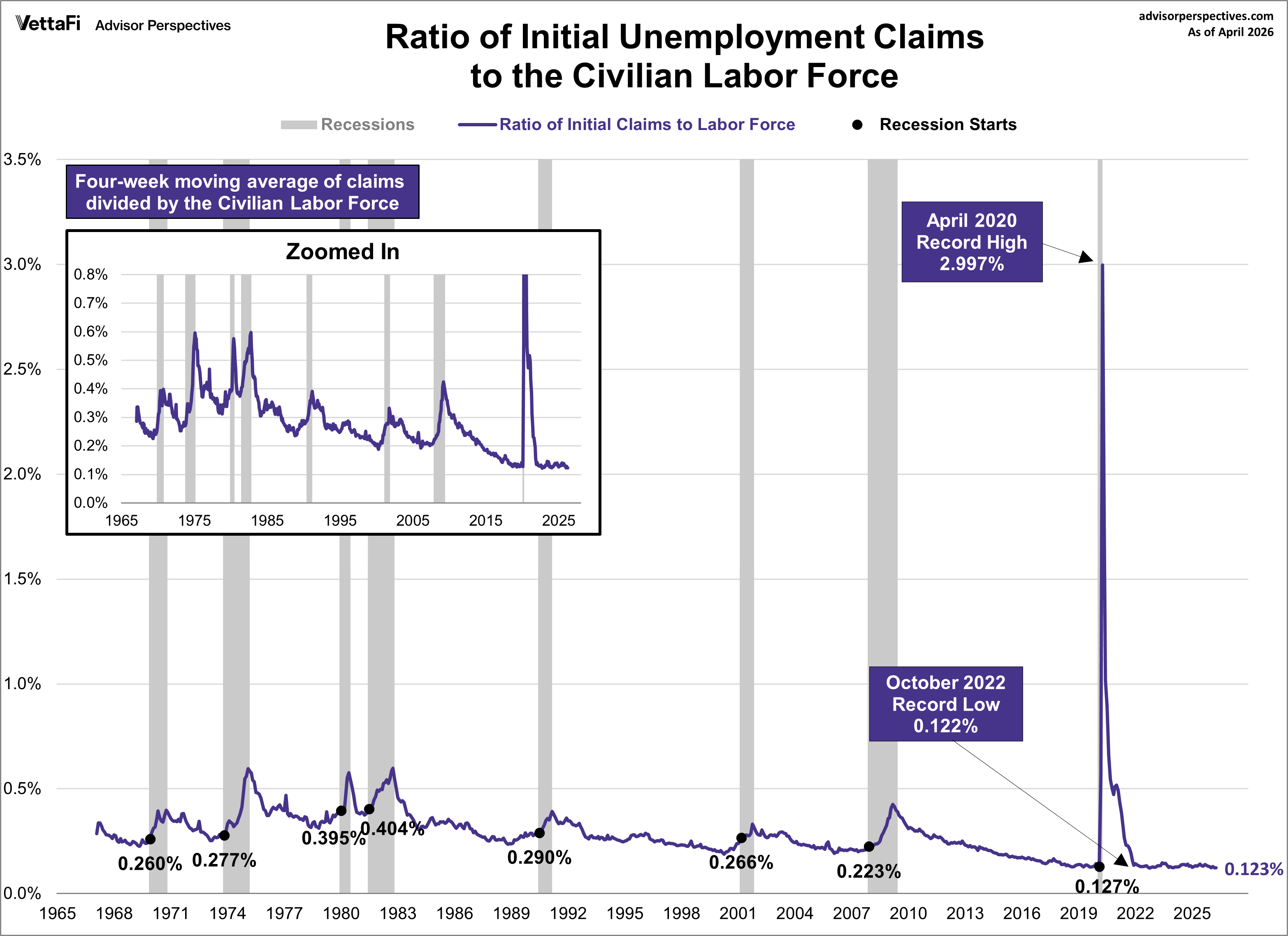
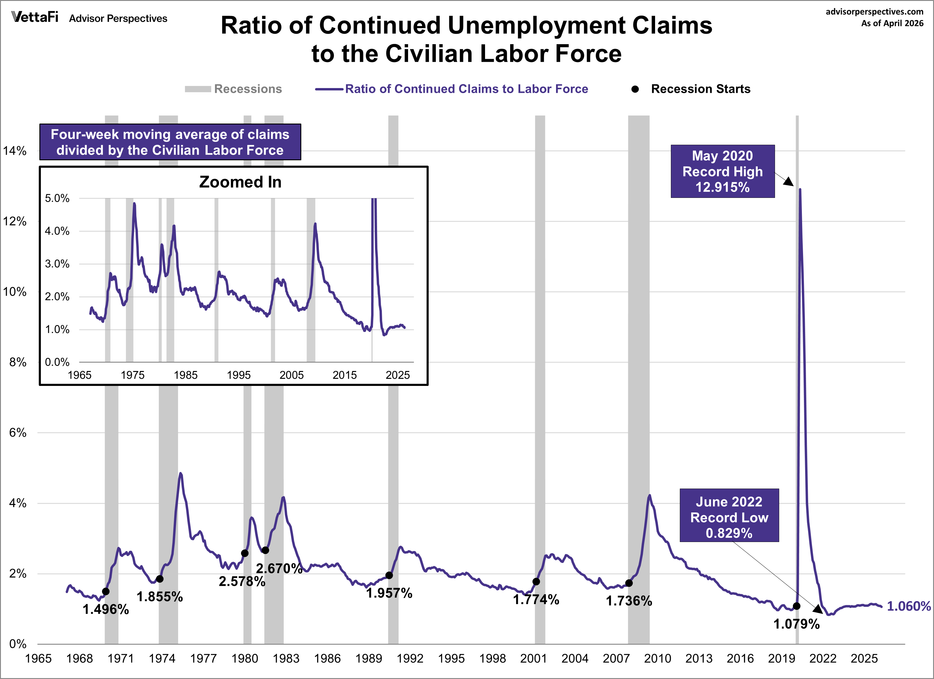
The Claims-to-CLF Ratio
By viewing claims as a ratio of the labor force, we get a much clearer picture of economic health.
For initial claims, the latest ratio is at 0.123%. This means only about 12 out of every 10,000 workers are filing for initial benefits. The latest ratio is well below its all-time high of 2.997% (April 2020) and is slightly above its all-time low of 0.122% (October 2022).
For continued claims, the latest ratio is at 1.060%. This means roughly 11 per 1,000 workers are receiving ongoing benefits. The latest ratio is well below its all-time high of 12.915% (May 2020) and is above its all-time low of 0.829% (June 2022).
Unemployment Claims as a Recession Indicator
What does the ratio of unemployment claims to the civilian labor force tell us about where we are in the business cycle and recession risk?
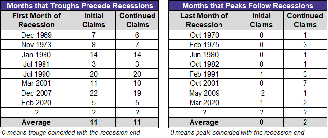
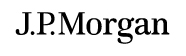
A particularly interesting feature of this unemployment claims ratio series is its effectiveness in the past as a leading indicator for recession starts and a virtually dead-on coincident indicator for recession ends. In both of the ratio charts above, we've highlighted the value at the month a recession starts. In every instance, the trough in claims preceded the recession start by a few too many months, but the claims peaks were nearly identical with recession ends. Here is a table showing the actual numbers.
The Bottom Line
We are currently 42 and 46 months past our respective troughs. In historical context, these are staggering durations that far exceed the previous maximum lead times for a recession.
Related Employment Updates:
Monthly Employment Report
Job Openings and Labor Turnover Summary (JOLTS)
ADP Employment Report
Weekly Unemployment Claims
Full-Time and Part-Time Employment
Multiple Jobholders
Five Decades of Middle Class Wages
Read more updates by Jen Nash