Market valuation indicators are used by investors and analysts to gauge whether markets are overvalued, undervalued, or fairly valued relative to historical norms. Here is a summary of the four market valuation indicators we update monthly.
- The Crestmont Research P/E ratio (more)
- The cyclical P/E ratio using the trailing 10-year earnings as the divisor (more)
- The Q ratio, which is the total price of the market divided by its replacement cost (more)
- The relationship of the S&P composite price to a regression trendline (more)
Key Takeaways
- Market valuation indicators show the S&P 500 is overvalued by 116% to 207% based on June 2026 monthly data.
- The four valuation indicators' average sits at 155%, remaining over 3 standard deviations above its historical mean.
- Market valuation indicators frame long-term investment return expectations rather than predicting short-term market direction signals.
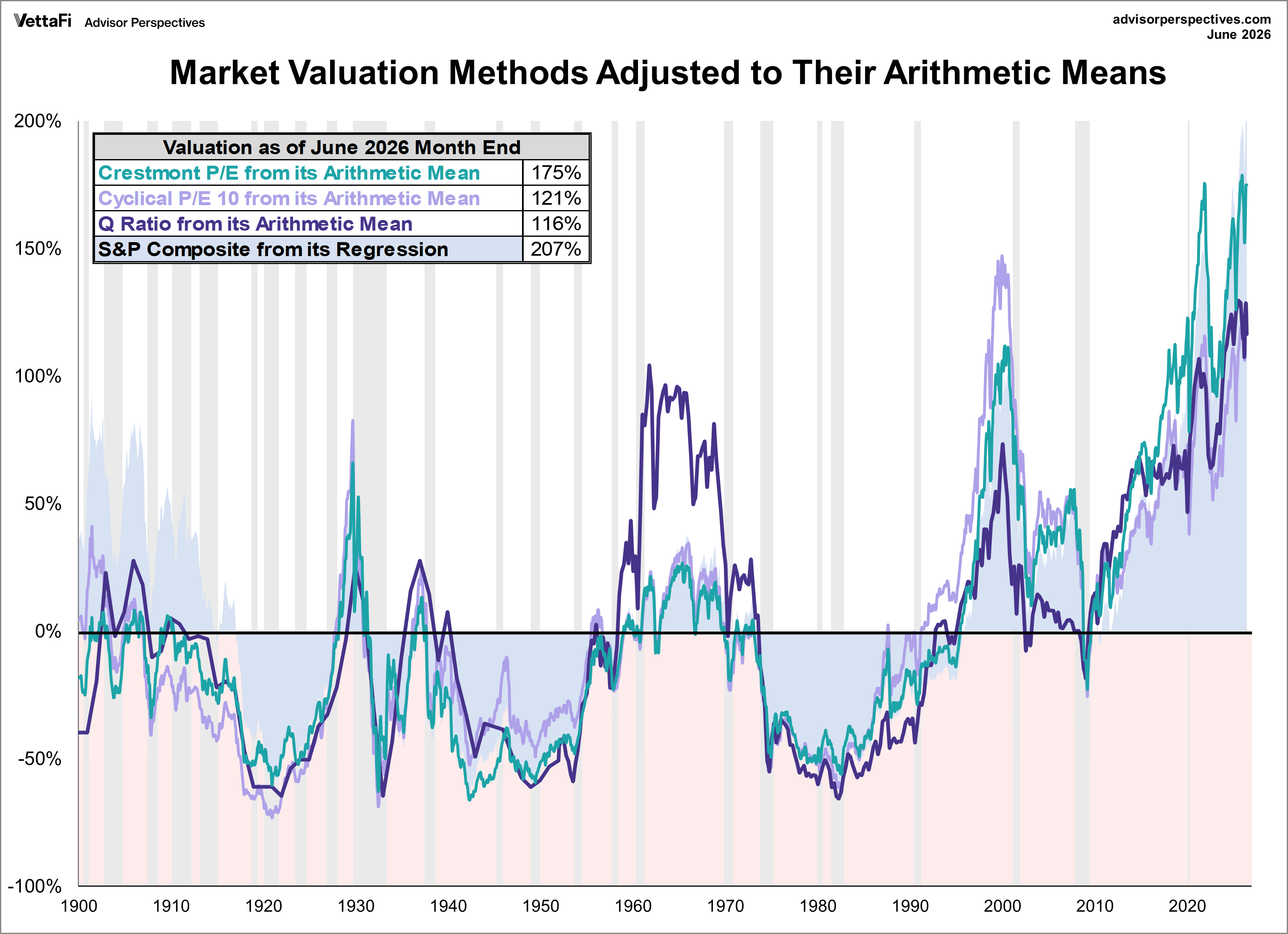
To facilitate comparisons, we've adjusted the two P/E ratios and Q ratio to their arithmetic means and the inflation-adjusted S&P composite to its exponential regression. Additionally, we've plotted the S&P regression data as an area chart type rather than a line to make the comparisons easier to read. This reinforces the difference between the line charts (which are simple ratios) and the regression series (which measures the distance from an exponential regression on a log chart). Thus, the percentages on the vertical axis show the over/undervaluation as a percentage above the mean value, which we use as a surrogate for fair value.
Current Market Status: Based on June's S&P 500 monthly data, the market is OVERVALUED somewhere in the range of 116% to 207%, depending on the indicator. This is one of the highest overvaluation ranges in history.

The Geometric Mean Alternative
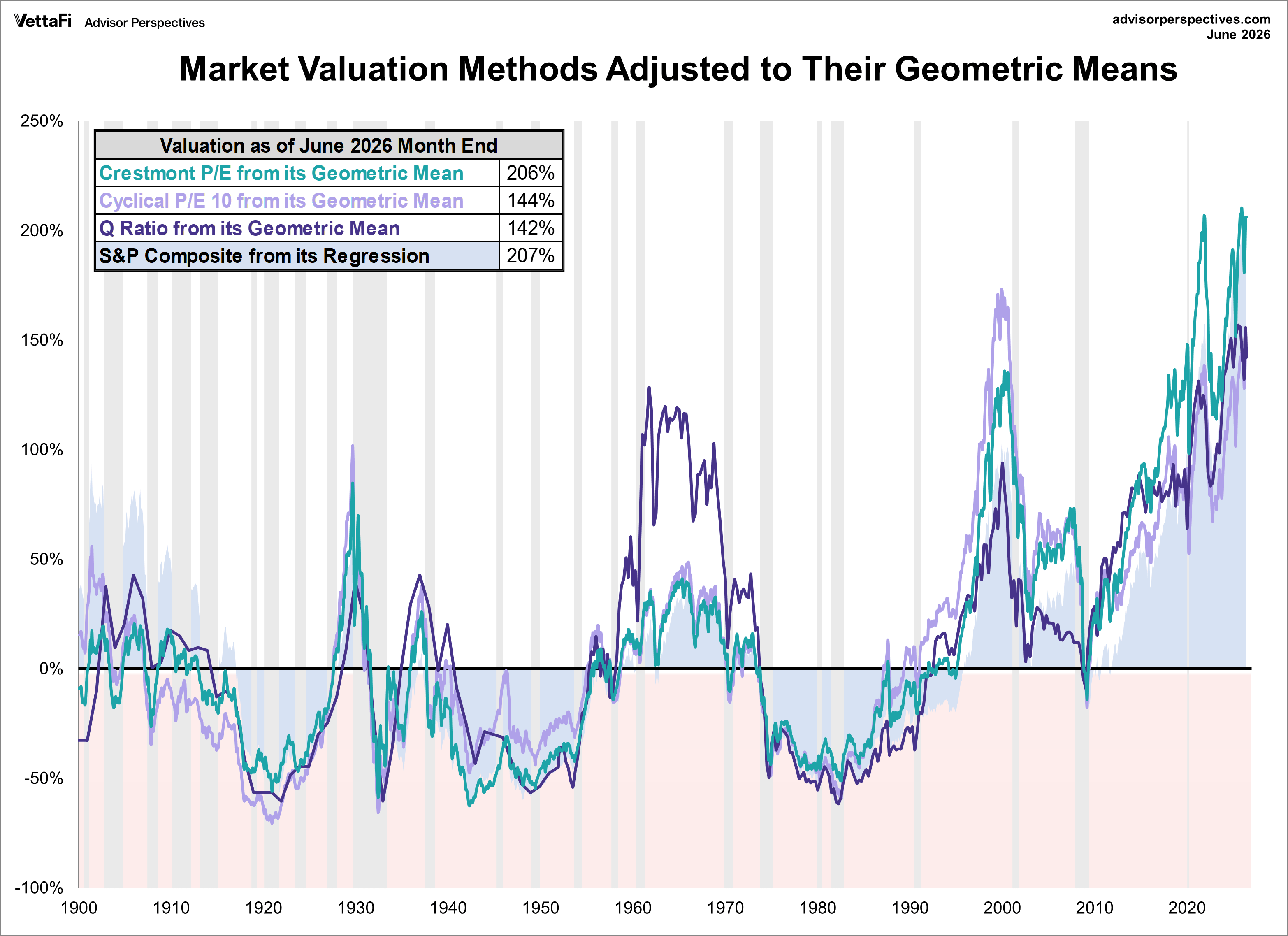
The chart below differs from the one above in that the three of our market valuation indicators—Crestmont P/E, P/E10, and Q-Ratio—are adjusted to their geometric mean rather than their arithmetic mean (what most people think of as the "average"). The geometric mean increases our attention to outliers. While the first chart does a satisfactory job of illustrating these four approaches, we've included the geometric variant as an interesting alternative view.
Current Market Status: Based on June's S&P 500 monthly data, the range of overvaluation for our geometric alternative sits between 142% to 207%, once again marking one of the highest overvaluation range in our series' history.
The Average of the Four Valuation Indicators
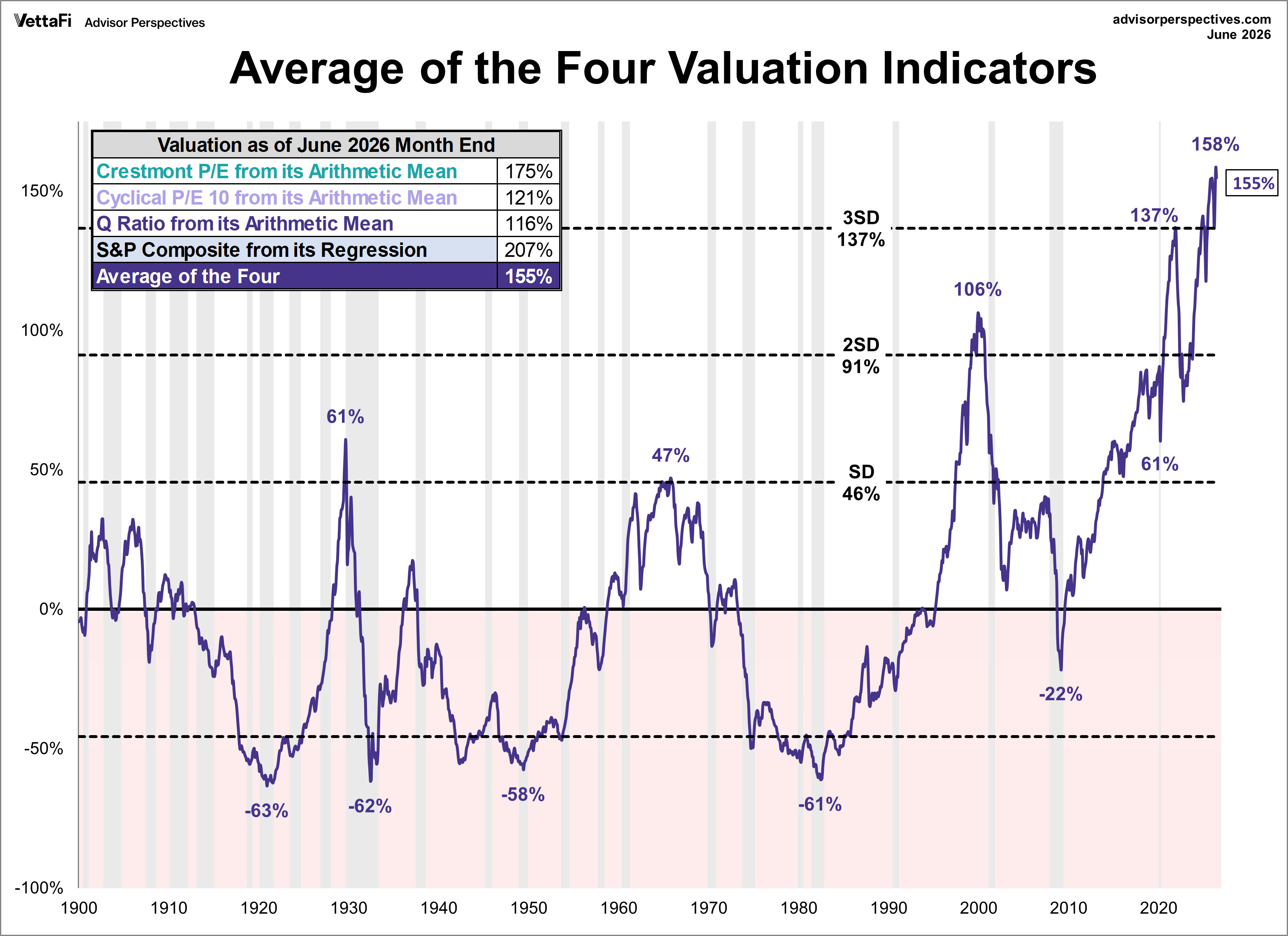
The next chart gives a simplified summary of valuations by plotting the average of the four arithmetic series along with the standard deviations above and below the mean.
Current Market Status: At the end of June, the average of the four is 155%, the second highest level in history. For a twelfth straight month, the average is more than 3 standard deviations above its historical mean, signaling a deeply overvalued market.
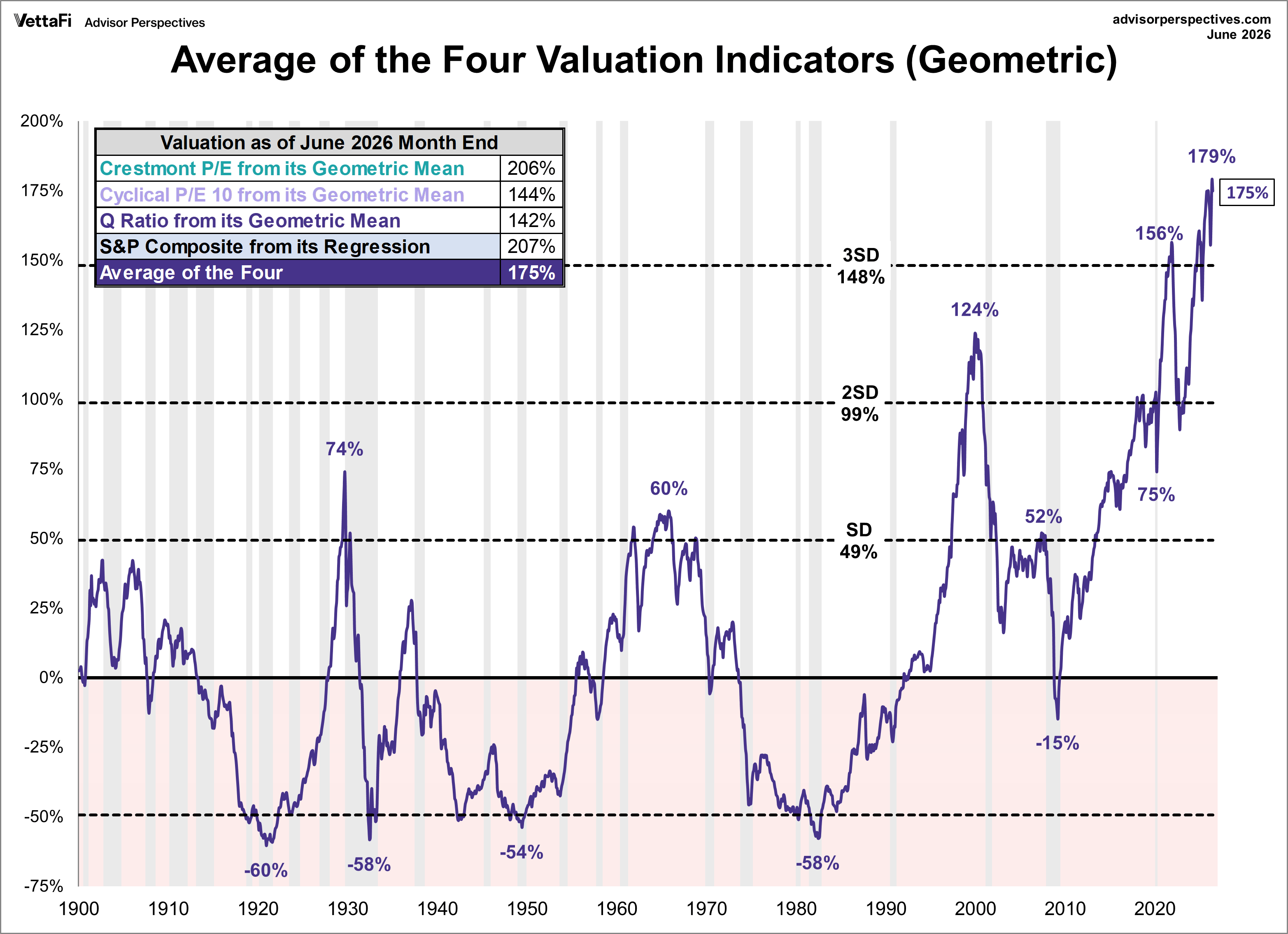
Below is the same chart plotted with the geometric mean and deviations.
Current Market Status: The latest geometric value of 175% is the third highest level in history. For a fourteenth straight month, the geometric average is more than 3 standard deviations above its historical mean.
As we've frequently pointed out, these indicators aren't useful as short-term signals of market direction. Periods of over- and under-valuation can last for many years. However, they can play a role in framing longer-term expectations of investment returns. For more on that topic, see our monthly update: Market Valuation, Inflation, and Treasury Yields: Clues from the Past.
Market Valuation and Actual Subsequent 10-Year Total Returns
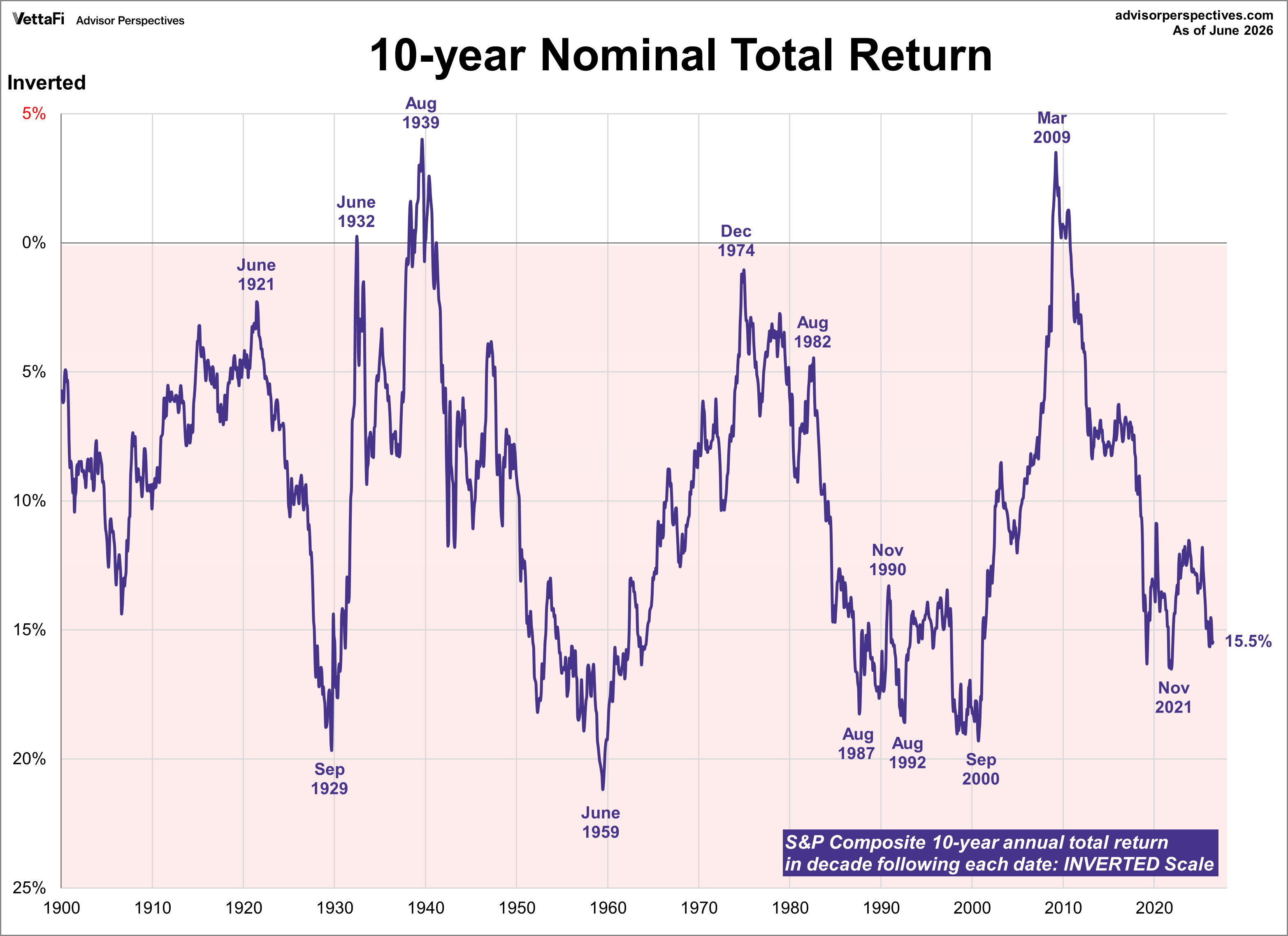
Many of our readers have requested we reproduce a chart by John Hussman that inverts the S&P 10-year total returns. Hussman says “the most reliable correlation between valuations and subsequent returns is on a 12-year horizon, which is the point where the autocorrelation profile of valuations typically hits zero.” The correlation of valuations Hussman uses for comparison is approximately 90%.
Nominal returns are used here as a direct result of a Fisher-effect, in which inflation ultimately ends up being washed out of the calculation. The nominal growth rate of the economy is highly correlated with the level of interest rates, but also negatively correlated with market valuations over the same time period.
Here is the geometric average of the four indicators alongside the recreated Hussman charts. Please note that the Hussman returns chart is inverted.
Points of ‘secular’ undervaluation such as 1922, 1932, 1949, 1974 and 1982 typically occurred about 50% below historical mean valuations, and were associated with subsequent 10-year nominal total returns approaching 20% annually. By contrast, valuations similar to 1929, 1965 and 2000 were followed by weak or negative total returns over the following decade. - John Hussman
ETFs associated with the S&P 500 include: iShares Core S&P 500 ETF (IVV), SPDR S&P 500 ETF Trust (SPY), Vanguard S&P 500 ETF (VOO), and SPDR Portfolio S&P 500 ETF (SPYM).
Read more updates by Jen Nash